Fresh Take Log Cabin
From Cheeky Tropical Beach Decor to Updated Lakefront Comfort
A fresh take on a log cabin Airbnb.
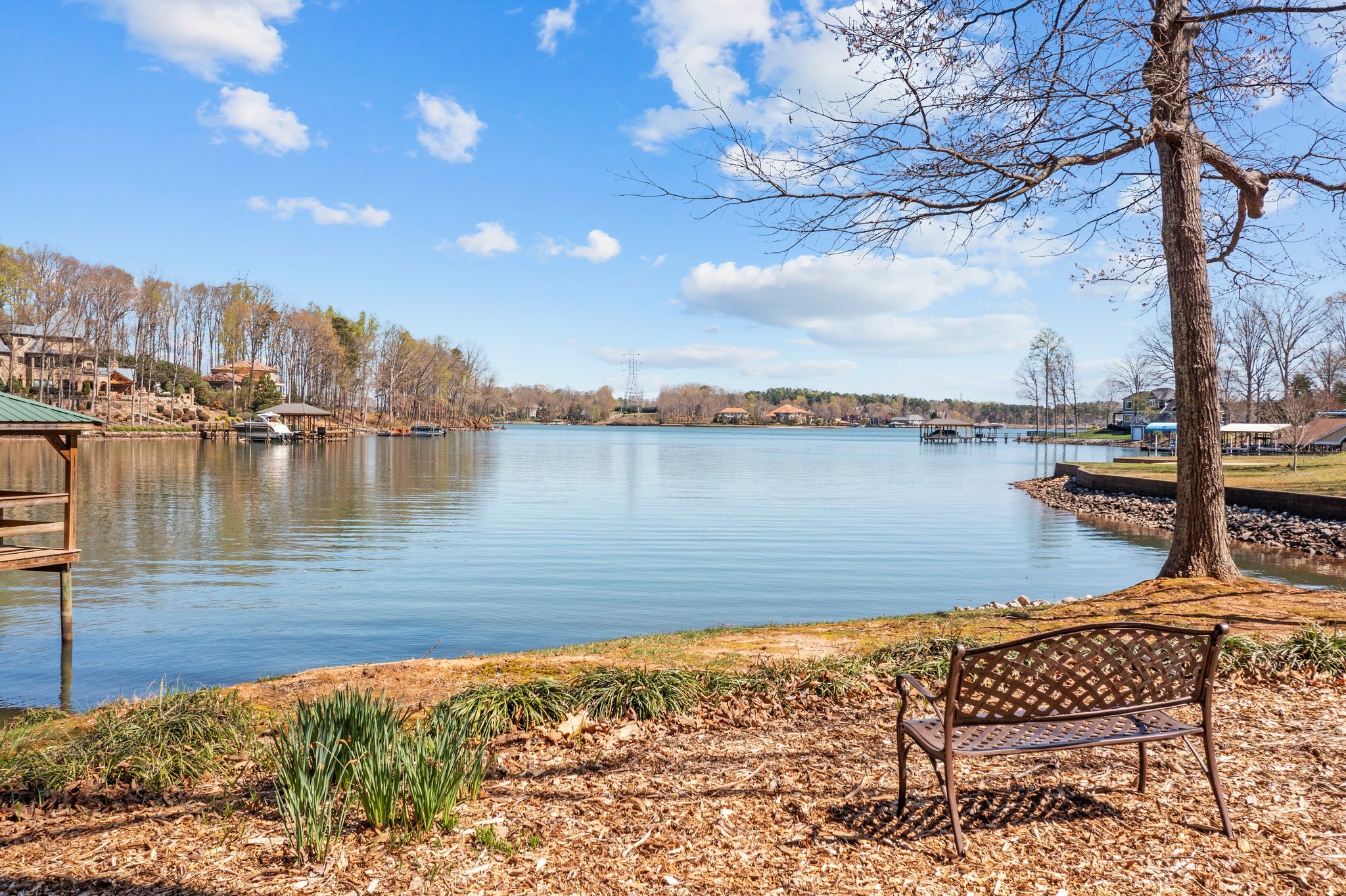
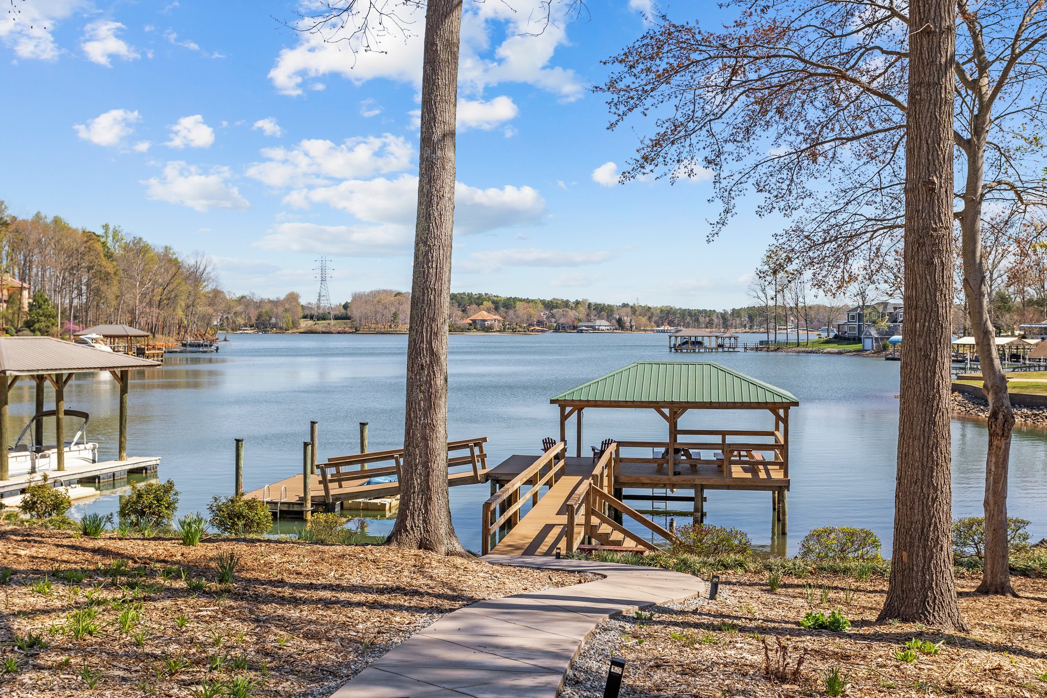
This 1980s log cabin is nestled in next to Lake Norman in North Carolina. The peaceful surrounding environment invites guests to vacation here and to enjoy all that the lake has to offer.
Redesigning the furnishings for this Airbnb was a huge undertaking because the cabin has so many different wood tones to work around. The other main challenges for this redesign were staying true to the architectural style of the home and working with some of the existing furniture pieces. My client and I wanted to elevate the decor yet keep in mind that everything needed to be affordable, comfortable, and practical for short-term renters.
Renewed Details
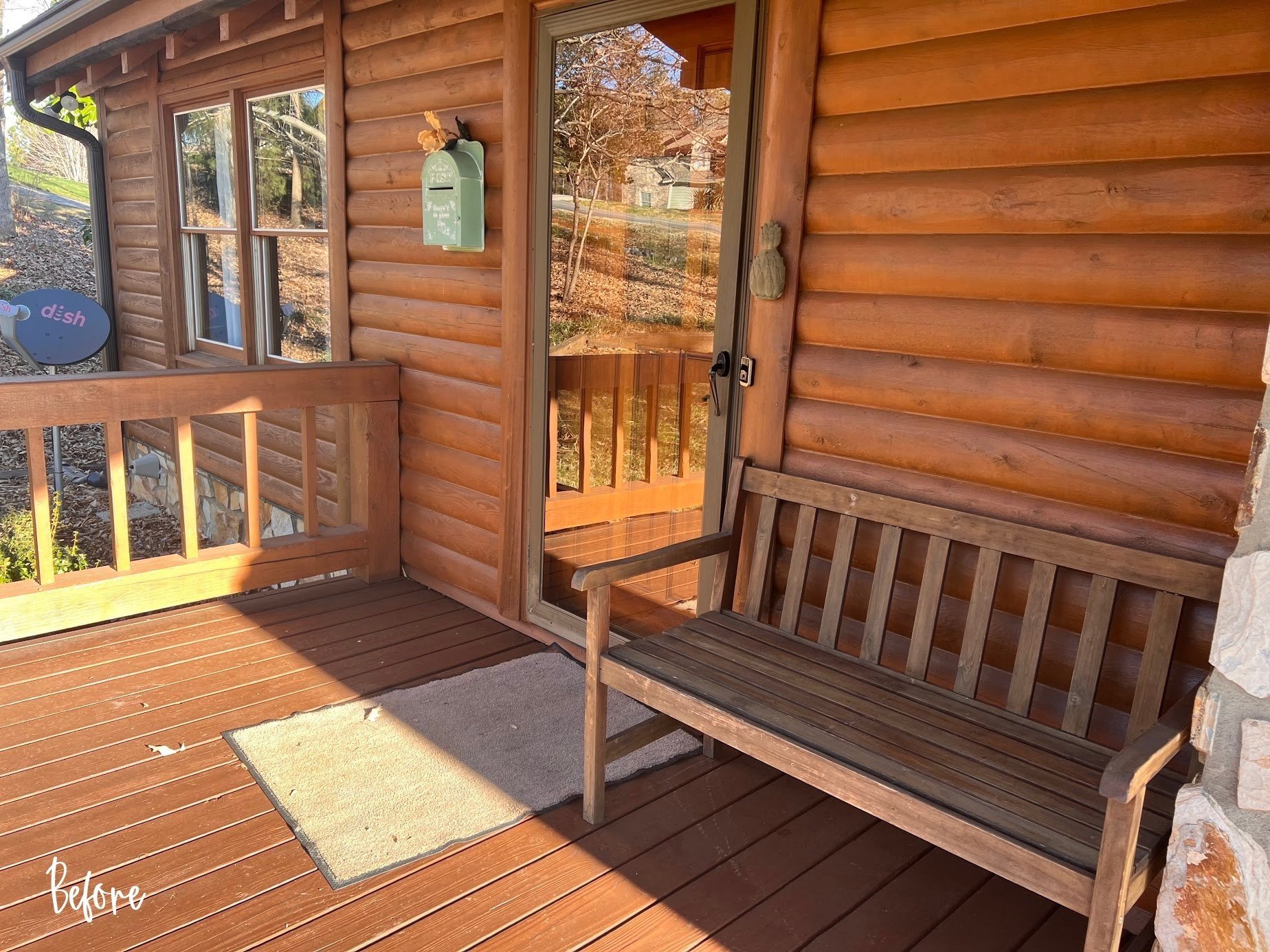
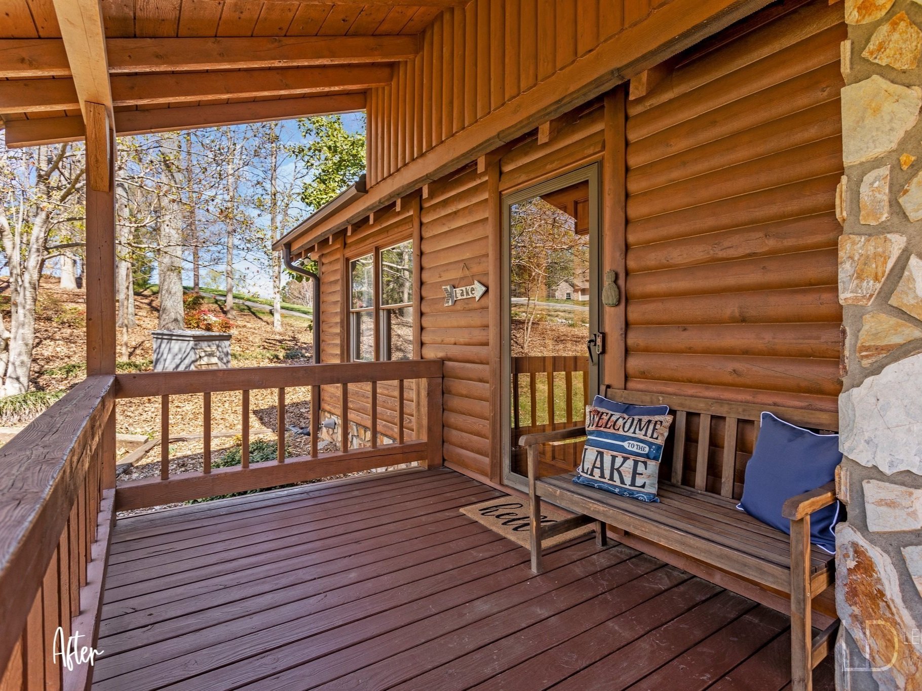
Upon their arrival, guests are welcomed to their vacation home with a whimsical wooden arrow sign pointing vacationers toward the lake. Fresh new pillows and a new doormat greet them before entering.
The Biggest Transformation
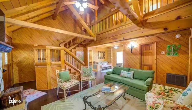
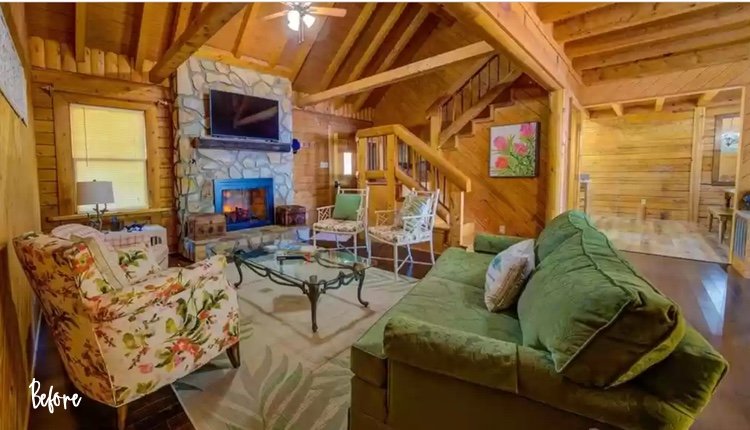
I personally feel that the living room has undergone the biggest transformation. We took The Golden Girls vibe out of this house and inserted a polished yet relaxed atmosphere.
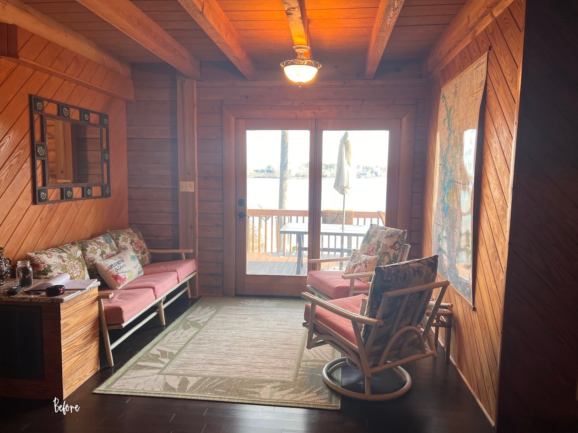
Living Room Before
Side note: I had a very difficult time trying to donate this furniture because I was told: “it was too ugly”! LOL
Living Room After
For the size and shape of the living room, I chose a more proportionately sized sectional that now allows for a better functioning conversational space. Before, the sofa and four chairs were uninviting and made the room feel closed off.
I included a new natural sisal rug layered with an outdoor area rug on top. In a short-term rental scenario, outdoor rugs are more practical in heavy traffic areas. They are easy to maintain and will stay looking nice after many guests have come and gone. It was an added bonus that I could reuse the blue rug found in another room.
New accessories, artwork and throw pillows tie together the blue and white color palette that can now be seen throughout the home.
Depending on the time of day, the two-story open living room can be very dark, so adding a table lamp was a necessity. Not only does the lamp add additional lighting, but the overall style of the lamp and the color white also make it stand out and add much-needed contrast to the wooden walls.
I added faux plants wherever I could to bring nature inside and liven up the interior. Before, the only plants to be found were the pink and green floral prints on the chair fabric, tropical leaves on the rugs, and the floral prints on the wall decor. Live plants would be ideal, however not practical in a short-term rental space.
Don’t Fight It… Work With It
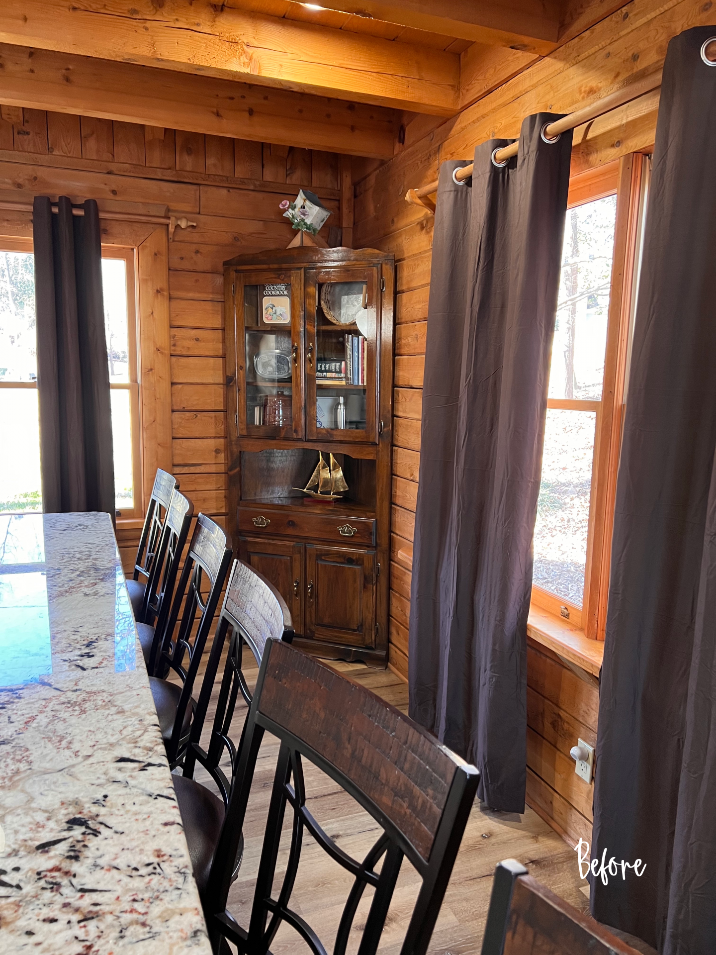
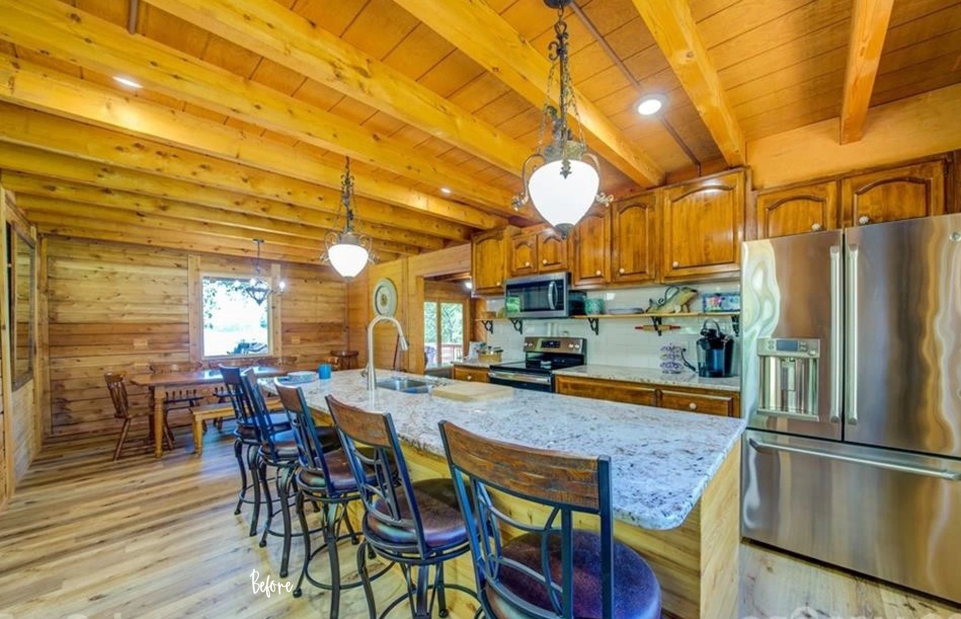
This kitchen has four different wood tones going on! The walls and floors are two different wood tones and then the island is a different wood tone than the wall cabinets! Ay, ay, ay… It wasn’t in the budget to make any cosmetic changes, so I had to figure out a way to work with what was there.
Kitchen Before
Hot Tip:
The log walls in this cabin all have an orange undertone making the walls the bossy main fixed element. By establishing what the bossy fixed elements is, I then determined blue to be the best color to work with this orange tone instead of fighting against it. Orange and Blue are directly opposite each other on the color wheel creating a complementary color scheme. When you choose complementary colors on the wheel, the warm and cool hues play off each other, producing palettes that enjoy the best of both worlds.
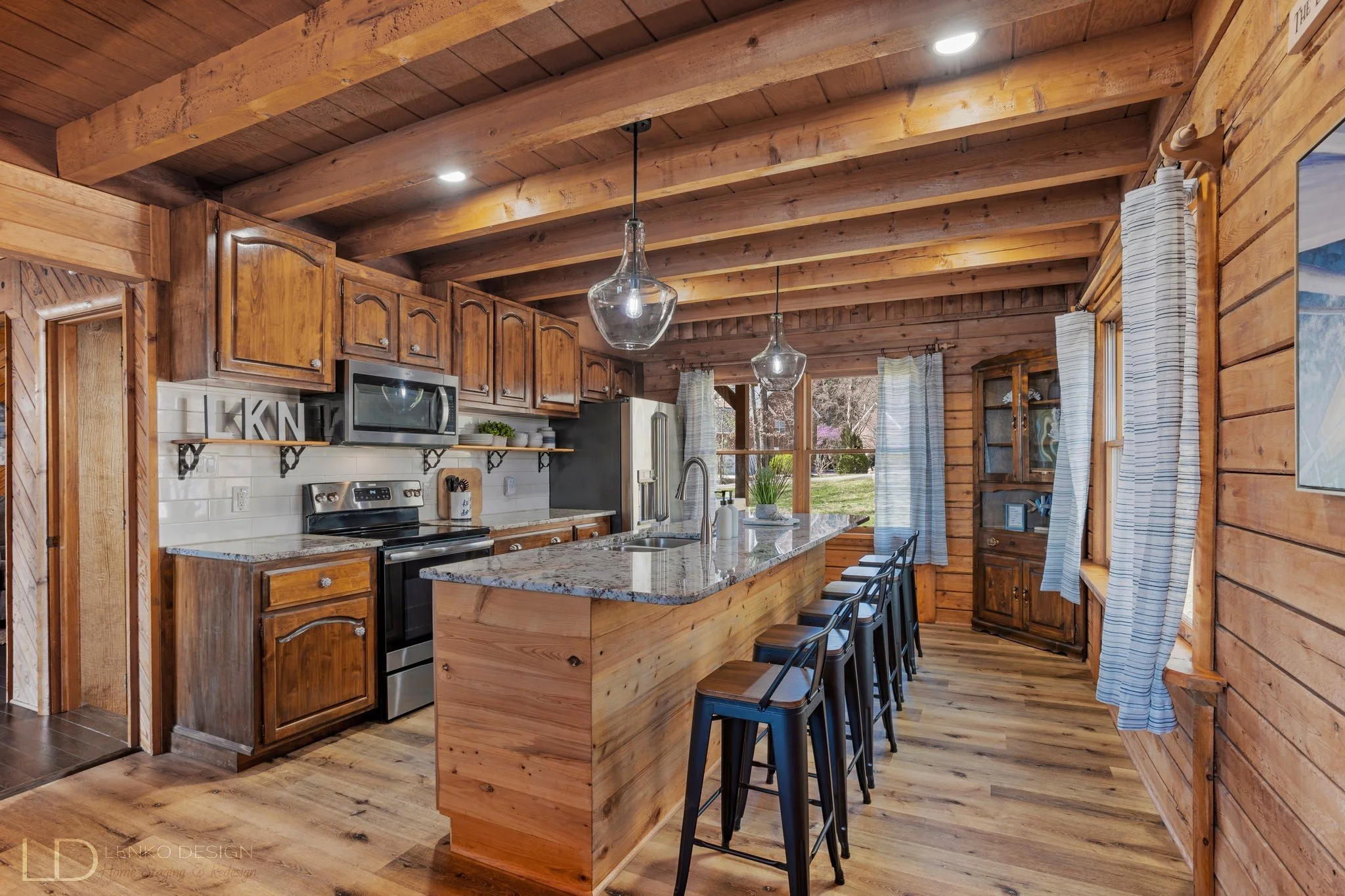
Kitchen After
If you notice we kept the blue and white knobs on the kitchen cabinets and drawers. Since this color palette was established, I ran with it and sprinkled blue and white throughout the house to create cohesion. We could have changed the cabinet hardware for something more modern and sleek, but the knobs are a little quirky just like this house!
We did, however, swap outdated light fixtures for these beauties! The elegant glass shape adds a sense of sophistication to the room. I restyled the open shelves and we purchased new industrial-style counter stools to tie in the matte black metal from the light fixtures.
Black and Bold
Before, the dining room was very uninspiring with the outdated dining set. The dining table and chairs were the same wood tone as the walls, which looks washed out and very dated. The dining table almost disappears into the sea of brown.
Dining Room Before
Now making a bold statement, this chic black table paired with matte black metal chairs is more pronounced.
Dining Room After
I love the metal stud detailing on the edges of the tabletop and the table base is so amazing!
That View Tho!
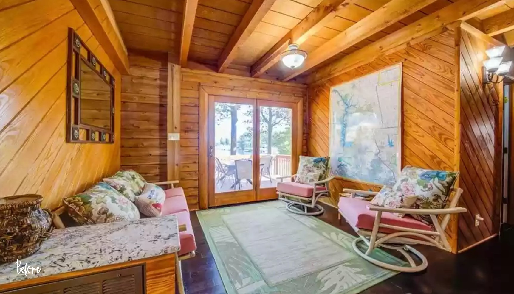
The view from this Sitting Room is breathtaking!
Before this space was underwhelming and honestly, I can’t get past the tropical print on this furniture to even appreciate the view of the lake!
Sitting Room Before
Sitting Room After
The oversized map of lake Norman was unique so we kept it where it was.
Blue accent chairs paired with a leather loveseat offer needed texture and color to this space. A faux fur throw blanket, bright white pillows, a colorful area rug, new sculptural wall art, and small decorative items take this space up to the next level.
Bedroom Styling
This cabin accommodates up to 15 guests. Ensuring guests have everything they need for a comfortable stay is a must when it comes to short-term rentals.
In an effort to save money, we kept and reused much of the furniture that was in the bedrooms. We did, however, update most of the beds with new mattresses and bed linens.
Primary Bedroom
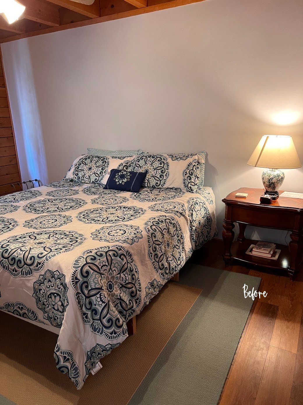
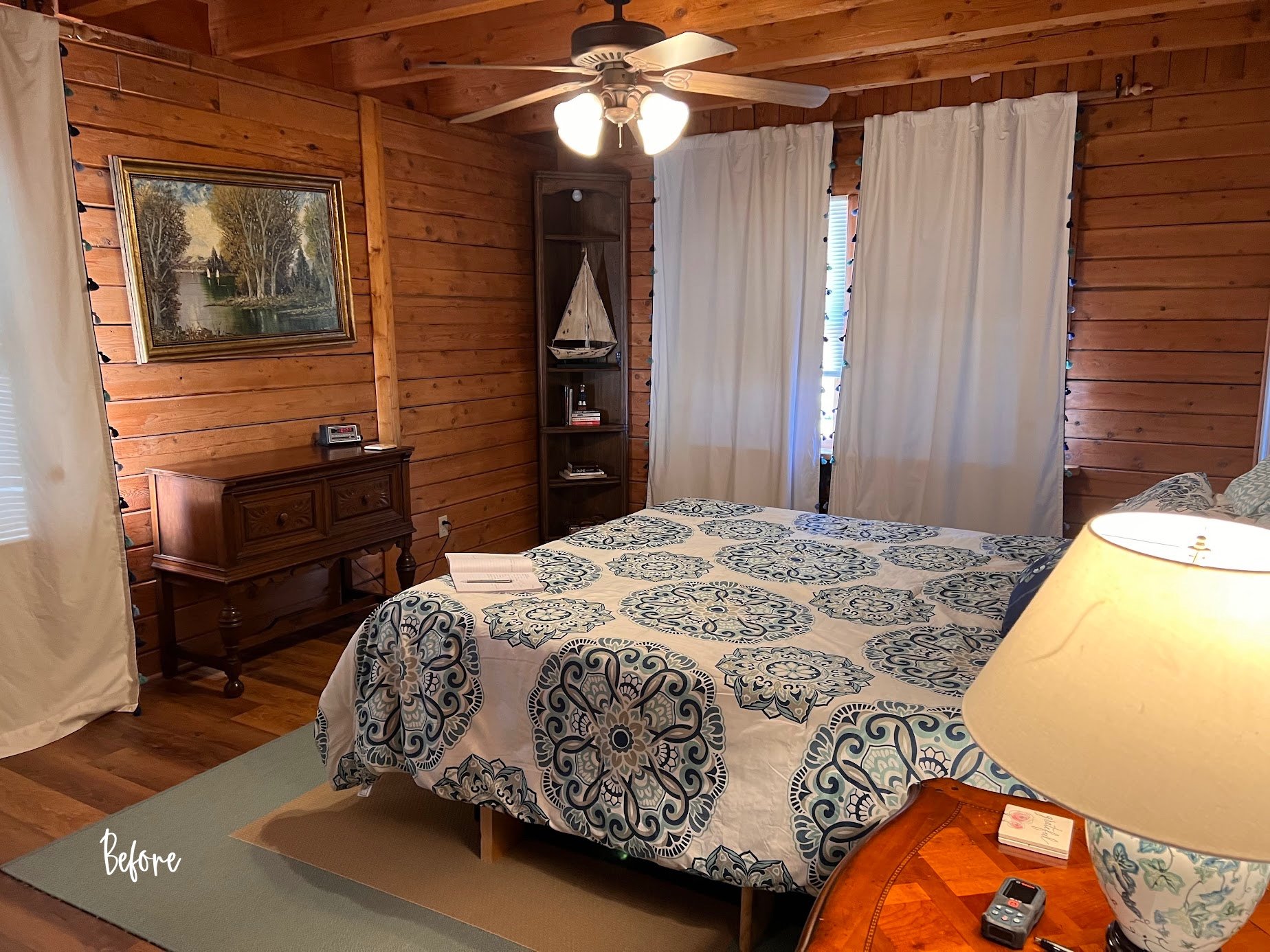
Originally this bedroom had a California King-Size bed. The room is large enough to accommodate this bed size, but I wanted to better use the space and create a more comfortable seating area, so we changed the bed to a King-Size.
Primary Bedroom Before
Primary Bedroom After
I was able to move two bookcases from the basement up to this room to use as nightstands. I found these sleek leather X-base benches for the foot of the bed which tie in the new black metal headboard.
I built my color palette around the existing rocking chair fabric which was in great condition. I purchased a new area rug, throw pillows, blankets, artwork, and accessories. The lamps came from another bedroom and I think they work great in this space.
Secondary Bedrooms
There are three guest rooms on the second floor and one more located in the basement.
In this first bedroom, I updated the bedding and used large Euro-size pillows to make up for the lack of a headboard. I incorporated nautical elements through the rope detailing on the lamps, oval mirror, clock, and coral throw pillow.
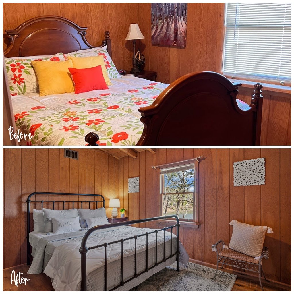
Bright white bedding freshens and brightens up the otherwise dark room.
The smallest out of all the bedrooms is also the darkest. I selected soft light blue bedding that has a slight sheen to it to help reflect light. Details like the embroidered “Welcome” pillows and plush area rug soften the space and create a more inviting atmosphere. Light-colored artwork also helps to break up all of the dark wood on the walls.
Bunkbed Rooms
We decided to keep all of the bunkbed frames. They were in great shape and only needed a little updating.
I liked the colorful nautical decor that was already in this room. I thought it was playful and perfect for younger kids. I added bright yellow clamp on reading lights and fleece blankets to each bed.
This white coffee table was originally in the living room serving only as a place for the internet and cable electronic boxes to sit. By moving the table to this bunkbed room and adding adorable poufs, young guests now have a play table area.
Creating a more sophisticated yet cool hangout space was a must. Updating the bedding in the basement bunkbed room allowed me to design a space better suited for teens.
I liked the leather settee that was there. To update the look though, I added textural faux fur throw pillows, a rug with a trendy boho pattern, and an interesting coffee table. Each bed now has updated more mature bed linens, a soft fleece blanket, and a reading light.
Game On!
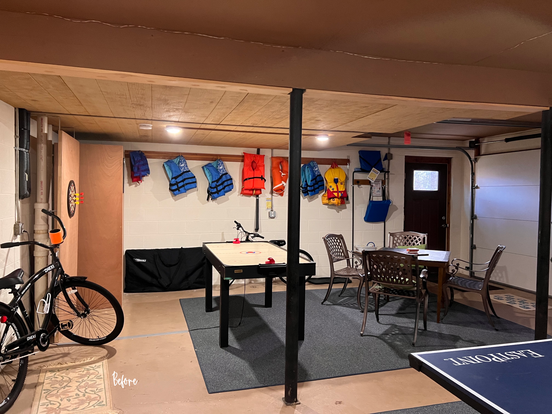
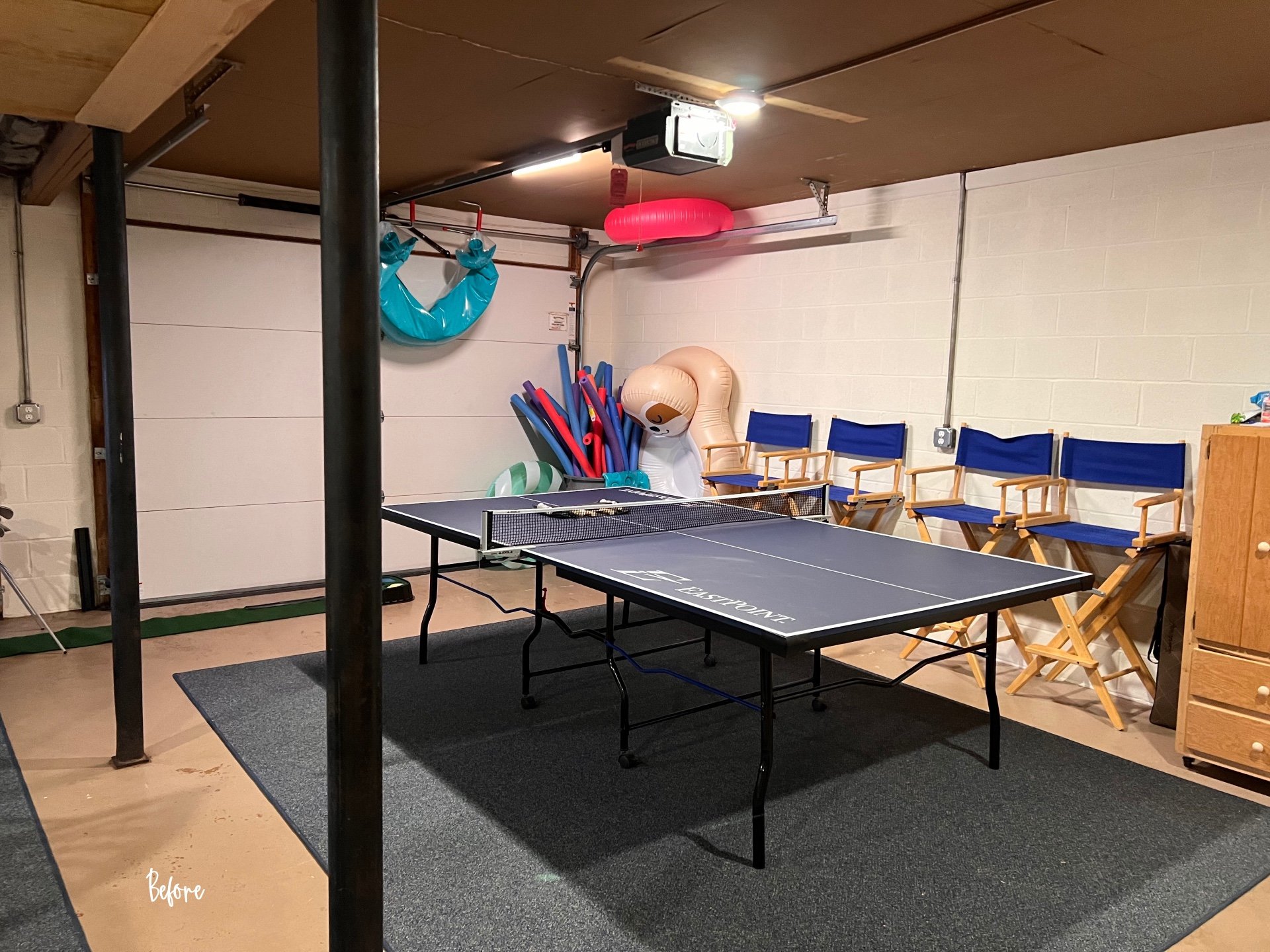
The garage space already had so many games and activities in it, but it felt cluttered and incomplete.
Game Room Before
We added two arcade games and for an added pop of color on the walls, I chose four adventure-themed movie posters from the 1980 era to speak to the time when this house was built.
Game Room After
The garage space is ready for guests to spend some quality time together!
All the Amenities
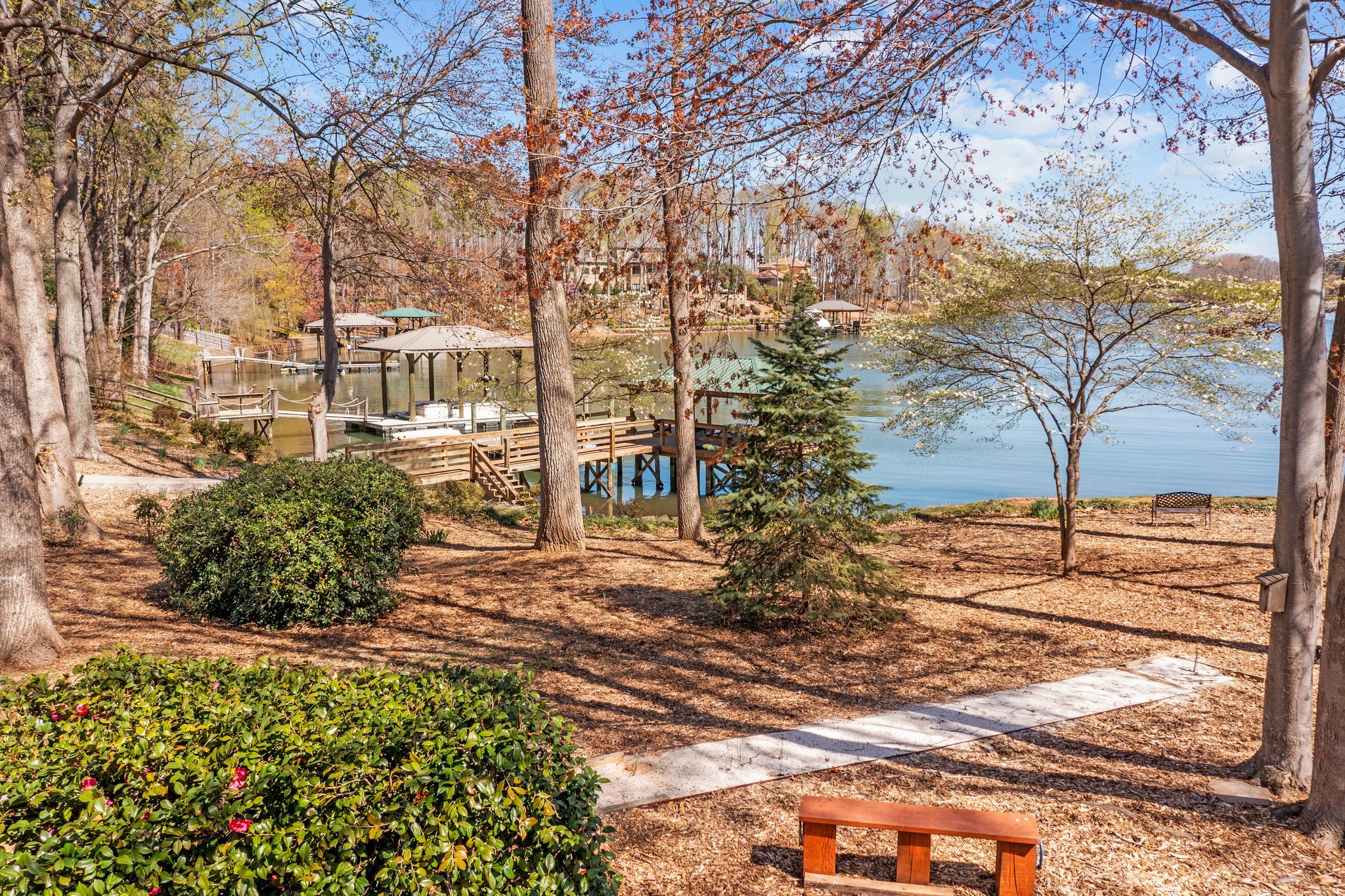
Enjoying the lake is only one of the great outdoor activities to do in Lake Norman.
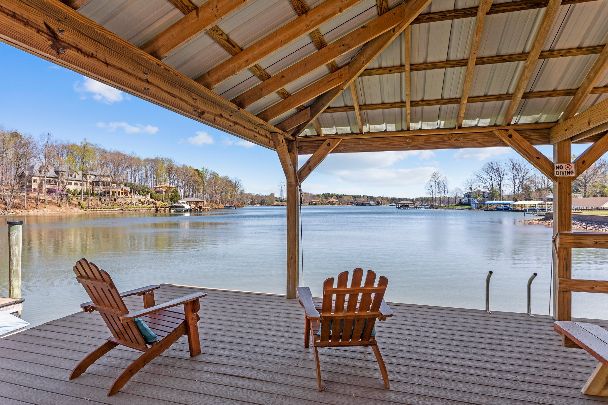
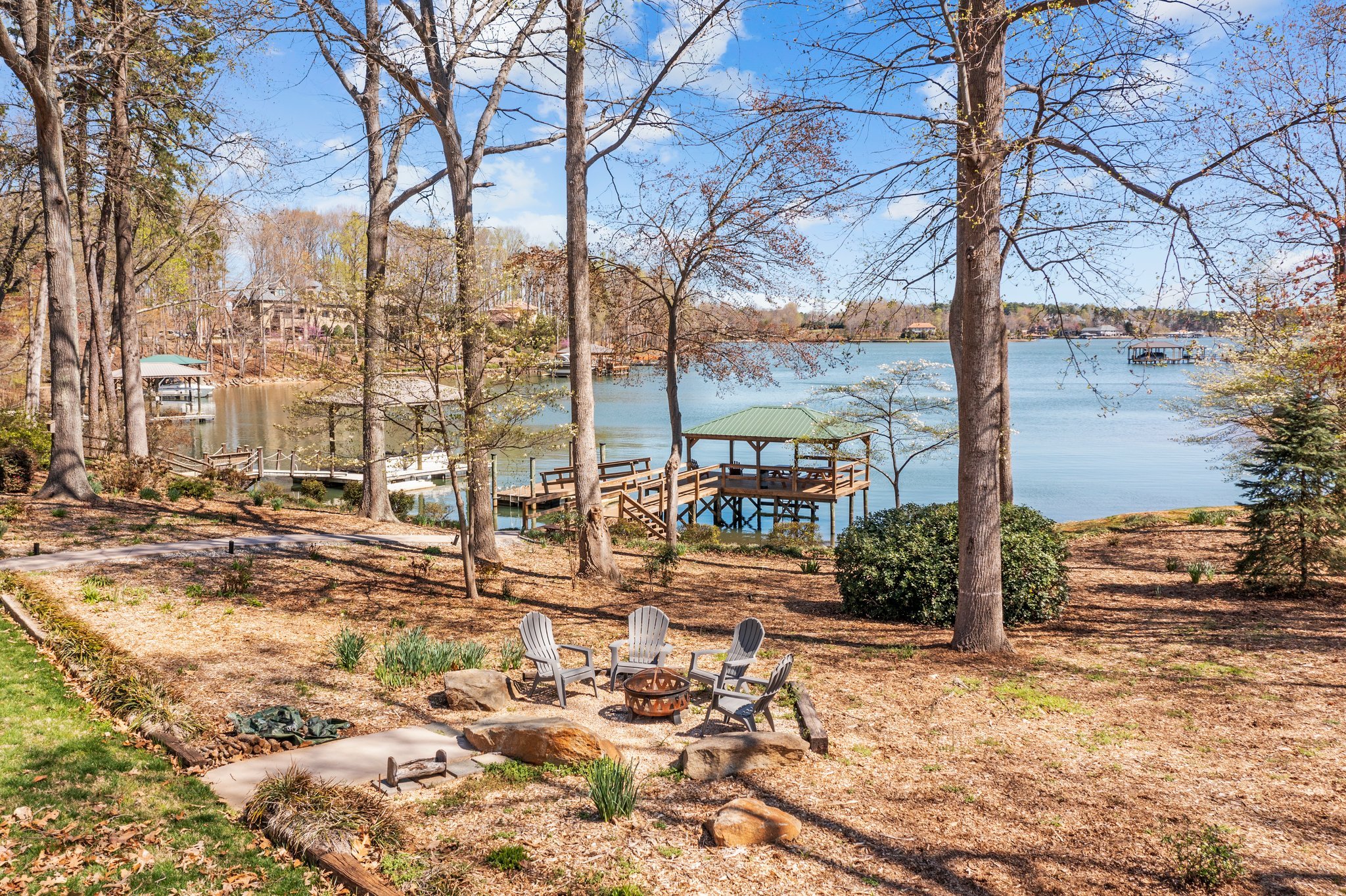
I liked how this house has a fire-pit, built-it horseshoe game, basketball hoop, and of course the dock with a paddle boat.
Jump in and make a splash!
This Airbnb has it all.
Plan Before You Plunge
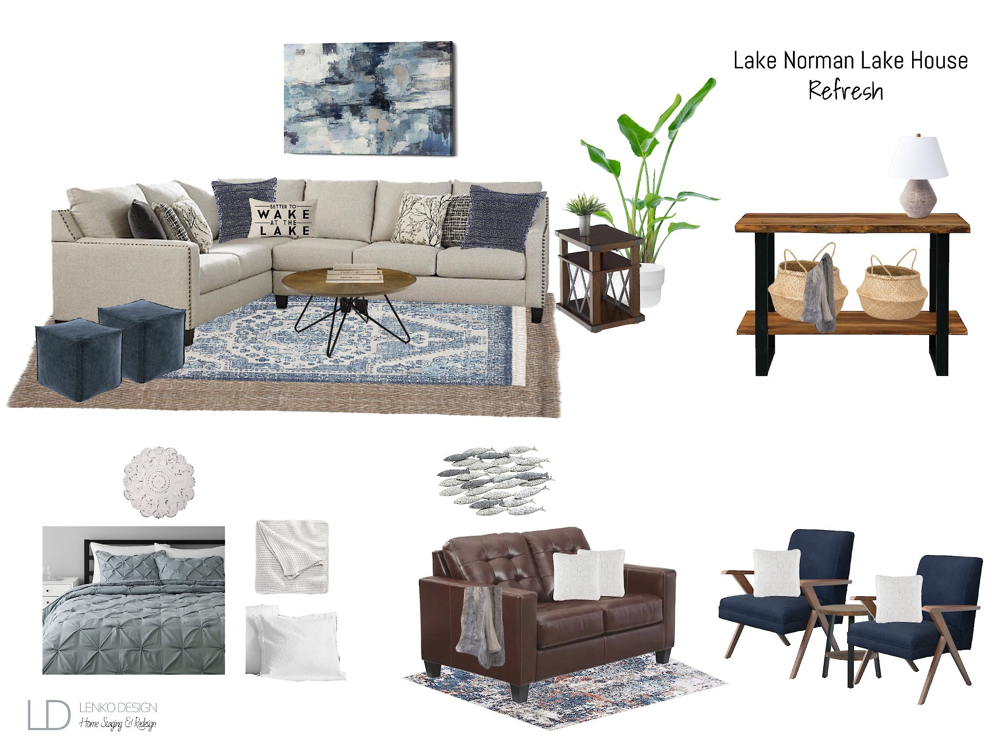
To show my client design concepts, I used my eDesign platform to create renderings so they could see my vision.
Every design should have a vision or mood board. It isn’t possible to fully put together a cohesive look without planning ahead and seeing everything put together.
Interested in staying in this cabin for your next vacation?
Planning for your own Short-Term Rental?
Download a FREE copy of our Short-Term Rental Checklist for all of the necessary guest accommodations.
Tiffani Michalenko
HSR Certified Home Stager & Expert eDesigner


