My passion for interior design derives from helping people just like you solve design dilemmas. My hope is that I can inspire you through my own life journey and what I’ve learned along the way. Thank you for your support. -Tiffani
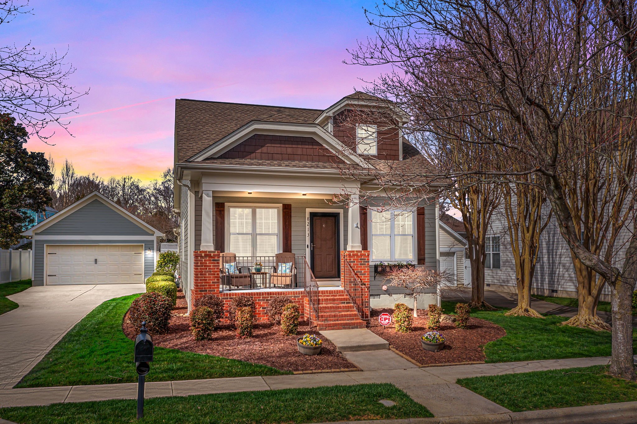
Charming Home in Birkdale Village Staged to Sell
Birkdale Village home staged to sell.
Lenko Design had the opportunity to stage a charming and quaint home in a thriving Birkdale Village located in Huntersville, North Carolina. While the seller had some key furniture pieces to utilize for staging, a few additional items were required to perfect the overall look.
Alluring Front Porch
On average, it takes 7 seconds for potential buyers to formulate a first impression. This is huge! People are viewing homes online so it is critical to show gorgeous listing photos that will allure potential buyers in.
This inviting front porch features custom wood window shutters, a well-manicured lawn, freshly planted flowers, new accent pillows that relate to the color scheme on the home's interior, and a new front door mat.
Buyers expect to be welcomed into a home that looks and smells clean and well taken care of. The entryway should be open, unobstructed, and inviting. The staging of an entryway establishes an emotional connection for buyers right from the beginning.
Simple decor items can be used to style an entryway. We hung a decorative mirror directly opposite the front door so that buyers would literally see themselves in the home.
HOT TIP: Hanging mirrors in the entryway is a great way for potential buyers to visualize themselves living in the home. Their reflection will be the first and last thing they see. Mirrors also reflect light and make a space feel bigger.
The Best Furniture Placement for a Corner Fireplace
It can be tricky placing furniture in front of a corner fireplace. We placed a sectional sofa perpendicular to the fireplace facing the room's entrance. This setup not only showcases the fireplace but also offers a pleasant view of the sofa. The area rug aligns with the sofa's direction, centered on both the focal point and the sectional.
Living room
Effective staging can eliminate uncertainties about arranging a room with a diagonal fireplace, transforming it into a desirable feature that enhances the overall attractiveness of the area.
Open Concept Spaces
Staging open-concept spaces takes a bit of finesse. We want potential buyers to have a clear distinction between spaces, yet the entire area needs to be cohesive.
The existing round dining table and chairs fit the dining area well. The kitchen was in spectacular condition. I asked the Seller to remove small appliances, the knife set, and other miscellaneous items that were unnecessary.
Dining Room and Kitchen
We relocated a console table from the office to the dining area to establish a coffee bar. Above the console table, I hung artwork that complements the colors of the living room and styled it with coffee-themed accessories.
The dining table now takes centerstage in this space with a beautiful vase and tall greenery.
The kitchen received minimal countertop accessories to not distract from the kitchen cabinet's wood stain or the window above the sink.
HOT TIP: Always highlight cleanliness and storage in a kitchen and pantry.
Creating a Home Office
In homes of all sizes, the trend of working from home continues to thrive, leading buyers to seek out dedicated office spaces for quiet work and privacy. Buyers aim to envision their future work setups clearly, yet not all homes come equipped with such spaces. When faced with a house lacking a designated home office area, think outside the box. Identify areas that can be repurposed into functional work-from-home spaces and make the most of the available space creatively!
Home Office
This home did have a designated spare bedroom that they were using as a home office as well as for storage. I asked them to completely clear out the room so that I could bring in a new desk to help clearly define this space.
An area rug adds depth and dimension to the space by anchoring the desk and chair. Proper placement of artwork and accessories is crucial for effective staging. The goal is to attract the viewer's attention to the focal point while enhancing the room's visual appeal.
Bedrooms and Bathrooms
The Primary Bedroom is critical for home staging as it is a top priority for potential buyers. They are interested in the room's size and envisioning their own layout and decor. I appreciated the furniture arrangement in this bedroom, but it seemed cramped with two nightstands. To create more space between the bed and closet door, we took out one nightstand.
I adore the window seat and architectural features in this primary suite. We enhanced these spaces with decorative pillows and crisp white bed linens and accents.
The bathroom has a tranquil spa atmosphere, complete with minimal countertop accessories. I enhanced it by including a bathtub tray with items that evoke a spa-like feel.
Guest Bedroom
The guest bedroom saw the most significant staging transformation. It was previously used for storage, craft projects, and various other purposes but has now been cleared to establish its identity as a bedroom.
The bed, artwork, and accessories breathe life into this room, showcasing its full potential.
Outdoor Spaces
In an age heavily influenced by technology, individuals are seeking solace in nature during their free time to detach from the digital realm. According to the National Association of Realtors (NAR), 57% of homebuyers are investing in properties in suburban areas, while 16% are choosing small towns and 15% are favoring urban locations that provide convenient access to backyards, fresh air, and outdoor recreational opportunities.
Buyers often seek a combination of indoor and outdoor areas. Arrange seating in an appealing manner and incorporate vibrant splashes of color. This setup will attract buyers looking for an outdoor entertainment space.
Recipe for Sucess
Enhancing the room with details attracts attention to the space and enables potential buyers to form an emotional connection with the property. Taking this extra step will ensure buyers fall in love and feel at home!
If you are serious about selling your home, here are 3 ESSENTIAL KEY STEPS you must take into consideration to make your home stand out from the competition:
Marketing Your Home On the Inside – Professional Home Staging
Marketing Your Home to the Public – Online Marketing, brochures, open houses, etc...
Pricing the House Right – Reviewing comparable homes in your area, getting a good agent, and finessing your price.
These three key steps are what aided this quaint home to sell in less than a month for $5k over the asking price!
I love how everything turned out in this home and I am very happy for both the seller and buyer!
FREE Home Staging Investment Guide
Want all the tips on how to make the most out of your Home Staging Investment?
Delightful Harrisburg Residence Staged to Sell
Owner-occupied home staged in Harrisburg, NC.
Lenko Design worked with the Seller to stage this delightful Harrisburg, North Carolina residence. The combination of the owner's personal belongings and LD's creativity has resulted in a warm and welcoming atmosphere.
The seller had an abundance of furnishings that needed to be paired down in order to get this home market-ready. We edited much of what they had and displayed only the best decor.
First Impressions
Impress prospective buyers with amazing curb appeal. When it comes to selling a home, you only get one chance to make a lasting first impression.
A manicured lawn, a new doormat, freshly planted flowers, and a Welcome porch sign greet guests as they enter this home.
We created a simple yet welcoming entryway by repositioning a console table, lamp, and a decorative mirror from the dining room next to the front door.
Edit Belongings
The Seller was a young and busy family. They, like many people, had an abundance of furniture and belongings. We went room by room during the Home Staging Consultation and took note of what should stay and what needed to be removed from each room.
The Seller ended our consultation time with a 25+ page Home Staging Report that included everything they needed in order to complete the staging process.
Let’s take a look at some of the transformations.
Living room
In the Living Room, we maintained the sectional layout for maximum openness. By adding colorful artwork to the mantle we drew attention to the focal point, which in this room is the fireplace. The oversized reclining chair was swapped with a smaller-scaled chair from another room.
HOT TIP: Remove family photos to protect your privacy and allow potential buyers to envision their own family living in the home.
By keeping only pieces that improved upon the rooms and emphasized the focal points, each room had a defined purpose in order to show potential buyers how they could use the space.
Dining Room
The area rug was placed under the dining table to help anchor the table in the center of the room. Excess and visually distracting wall decor was removed from the walls.
To create an even more spacious room, the oversized console cabinet was moved into the Living Room. The scale of the cabinet worked better under the wall-mounted TV and was more proportionately scaled for the Living Room.
Formal Sitting Room
This room is located immediately to the left of the Foyer and was being used as an office/craft room.
When staging a home for sale, it is important to stage a room with its intended purpose so a future buyer can visualize the room as it was designed by the builder.
Once the majority of the crafting supplies were boxed up and moved out of the room, we could then place the piano and oversized recliner in here.
Kitchens and Bathrooms
The Kitchen is the “Heart of the Home” and should be staged so showcase its features.
When living in a home while it is for sale can be challenging. The house needs to look like a model home, yet be lived in!
If possible, pack up any dishware or appliances that don’t need to be readily accessible. Tuck away daily use items as best you can in the cabinets or pantry.
When staging a Kitchen, it’s important to clear off all of the countertops, but then add in personal touches so it exudes a homey vibe.
For a simple vignette next to the stove, we used a wooden cutting board propped up against the backsplash with an olive oil container in front of it. These little details create memorable moments that catch the viewer’s eye!
Primary Bathroom
A crisp clean clutter-free bathroom will speak volumes to potential buyers. They want to see the spaciousness and cleanliness, not any of your personal hygiene products.
In this bathroom, we chose to keep accessories to a minimum. The neutral fixed finishes (white cabinets, white tub, white shower, and beige flooring) allow for some pops of color. We kept the area rug for the colorful visual interest and displayed pink beige towels that picked up the lighter undertones found in the area rug. The warm wood-tone basket on the countertop anchors the pretty marble and gold soap dispenser. The tub features an orchid, a pleasantly scented candle, and textural bathing items.
Defining The Purpose of the Room
As previously mentioned, when staging a home for sale each room should have a defined purpose so that a buyer can easily distinguish what the intended purpose of the room is and how they might use the space in the same way.
Let’s talk about bedrooms for a minute.
The Primary Bedroom
In this home the furniture placement in the Primary Bedroom was not ideal. The bed was placed between the windows on the shortest wall. Instead, the bed should be placed on the longest wall.
Do you now see how rotating the bed opens up the room tremendously and displays better flow and balance throughout?
This home had a total of five bedrooms plus a huge bonus room they were using as a bedroom/playroom. It’s important to first ensure the Primary Bedroom is staged and then decide the priority level of the ancillary bedrooms.
Guest Bedroom
The Guest Bedroom was full of boxes and random items that needed to be removed from the home and put into a storage unit. The room was a decent size, but too much furniture was making it feel smaller than it really is. The double nightstands were overcrowding the space when entering the room, so we opted to remove one nightstand.
The area rug was oriented incorrectly, so I asked the Seller to rotate the rug so it fit parallel to the bed frame. The Seller had the teal bed linens in a closet that we used on this bed. Simple styling on the nightstand add just the right amount of visual interest.
Home Office
In a multi-bedroom home, it is ideal to show a home office when possible.
Once you stage the Primary Bedroom and at least one other bedroom is staged as a bedroom, you could consider staging any other ancillary bedrooms as a home office.
We transformed what was once a little girl’s bedroom into the Home Office. With so many people working from home nowadays, it is always a great idea to show potential buyers where they could put their workspace.
All of the miscellaneous children’s items were removed from the room. The desk from the Formal Sitting Room was moved up to this room. A simple, yet effective layout shows how this space is large enough to be someone’s office.
Creating lifestyle moments throughout the home helps homebuyers envision themselves living in the house. Invoking positive feelings by styling vignettes with accessories, lamps, artwork, and pillows helps to create memorable aspects of the home that will stick with buyers as they view it. Details are what make a house stand out from the rest.
Savvy home sellers realize that creating a “show home” environment will entice buyers. Going the extra mile and paying attention to every single detail will pay off in the end!
Bonus Rooms
If you are fortunate to have bonus rooms in your home, highly consider staging these rooms because they are added selling features and should be showcased.
Laundry Room
As a busy family, this laundry station became a major drop zone. The Seller needed clear direction for what to pack and remove from this space.
After all of the unnecessary items were removed, we styled with fluffy white folded towels, filled jars with laundry items, and styled a metal tray for the countertop.
Kids Playroom
There was a lot happening in this room. The Bonus Room was being used as the children’s bedroom and play area.
A good majority of the toys needed to be removed from this space as well as one of the beds. We placed the bed into another bedroom allowing us to create a defined play area.
The room looks so much more spacious and organized!
Is Home Staging worth it?
Professional home staging can lead to faster sales, higher selling prices, and increased buyer interest.
Staged homes have improved online appeal, evoke emotions, and showcase the property's potential. Although it requires an investment, the benefits outweigh the costs.
Staging emphasizes the property's strengths and can mitigate limitations, with a unified design showcasing unique features and helping buyers envision their life in the home.
This home seller did the hard work needed to sell quickly and for top dollar.
So YES, Home Staging is worth it!
FREE Home Staging Investment Guide
Want all the tips on how to make the most out of your Home Staging Investment?
Paint Color Predictions for 2024
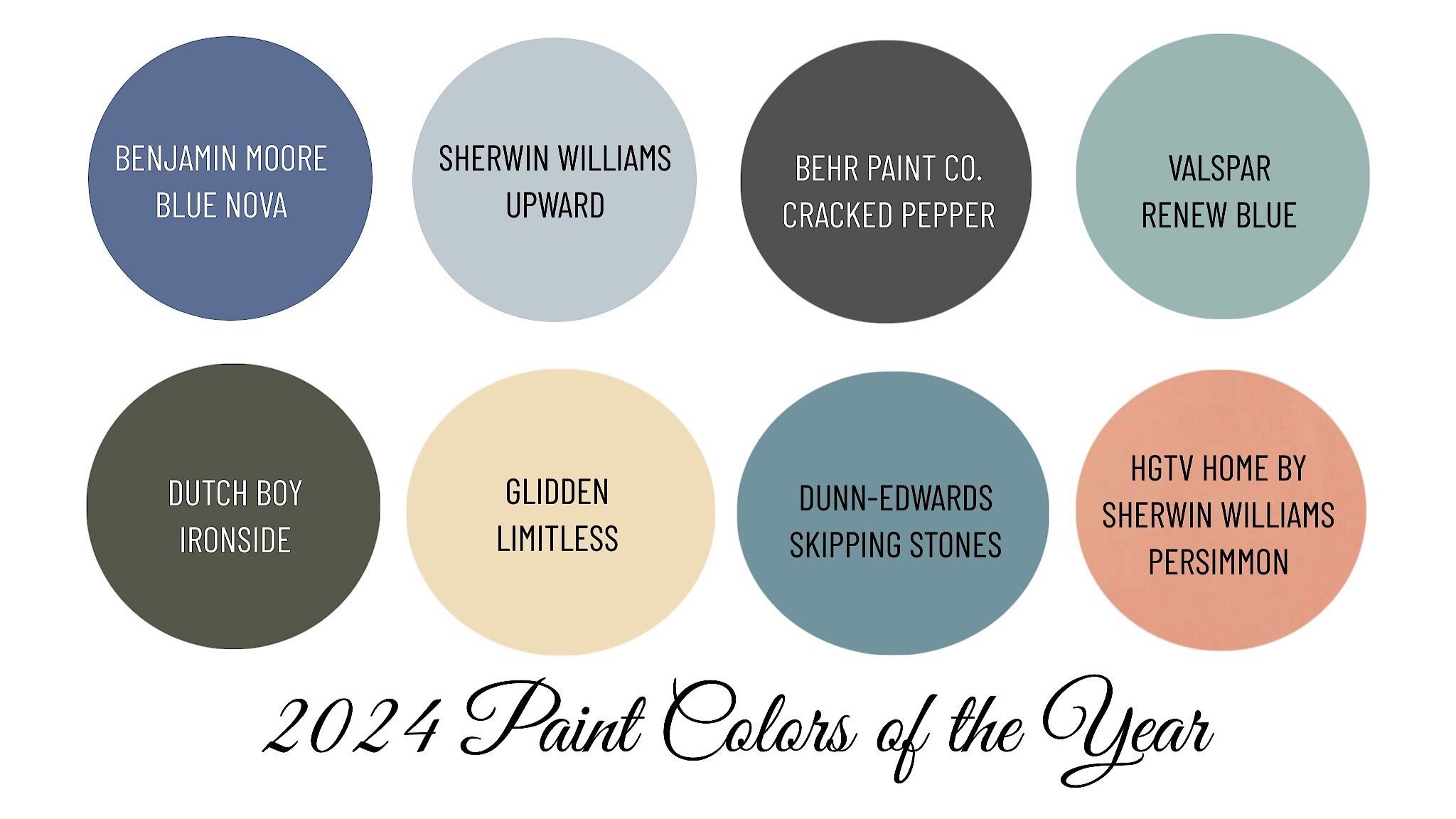
2024 interior paint color predictions.
It’s that time of the year again when all of the major paint manufacturers present their color forecast and announce their representative color for the upcoming year. Each paint company spends hours researching and observing the current cultural climate resulting in colors symbolic to it.
I’m excited for their trend predictions!
Color forecasters are predicting palettes chosen for their distinct presence and personality. 2024 is predicted to be a year of coastal-inspired blues and calming neutrals contrasted with moodier hues, such as olive green and black. This year’s trend cycle is a stark contrast from 2023’s saturated yet playful color palette.
If you are ready to give your walls a fresh update, take a look at what paint manufacturer experts believe will be big next year.
Here’s some color inspiration.
Sherwin Williams
Sherwin Williams announced their color for 2024 is Upward SW6239. A blissful blue hue inspired by coastal aesthetics.
"We knew lighter tones were going to be important in 2024 and 2025 and we wanted to forecast the shift from earthy neutrals to lighter expressions and a light blue like Upward SW 6239 told that story very well," says Sue Wadden, director of color marketing for Sherwin-Williams.
The soft hue complements a variety of design styles and looks great with antiques, modern furniture, transitional pieces, and even boho interiors.
Benjamin Moore
Blue seems to be a recurring color across the paint brands.
Benjamin Moore did not disappoint with their Color of the Year pick Blue Nova 825. “Elevate the everyday and expand horizons through juxtaposed color that is sure to inspire. With Blue Nova leading the way, depth and intrigue are balanced by an undercurrent of reassurance. This alluring mid-tone features an enchanting duality, capturing the spotlight with endlessly classic appeal” Benjamin Moore.
Feeling Blue? Every year I look forward to curating fun mood boards featuring the colors of year chosen by top paint brands Sherwin Williams and Benjamin Moore.
I personally love to design with blue!!!
I think these story boards showcase the personality and versatility of each color.
Which do you prefer?
Behr Paint
Behr Paint Company took a different approach with their color selection.
The selected a moodier, edgier color for those who are ready to embrace a color that encourages homeowners to take a leap. Cracked Pepper PPU18-1 is described as “a versatile soft black hue, acting as a neutral, creating a grounding shade that trends away from classic white-and-cream colors” - Behr Paint Company.
"The moment now is about optimism, awakening the senses, and elevating how you feel—and a room with a soft black really checks the box on all of those things," says Erika Woelfel, vice president of color and creative services at Behr Paint. Cracked Pepper works with everything from dusty pastels and metallic accents to earthy shades and bold patterns and textures.
HOT TIP: Choose your paint color LAST! Trust me on this one. If you paint first and then decorate, the paint color may not work with what you've chosen and you'll end up hating the wall color. Instead, build a color palette off of your fabrics, area rugs, or artwork.
Blue is one of my favorite colors to design with. Below are some rooms in my home where I used blue!
I chose to incorporate Sherwin Williams Granite Peak SW6250 throughout our first floor. The deep hue is rich and so beautiful in person. I selected this blue based on a blue and white vintage inspired area rug.
For a cohesive color palette, Granite Peak was painted on different surfaces beginning at the front door over across to the fireplace, in the Powder Room, and on the half knee wall behind a sofa.
Varying shades of blue are repeated throughout and can be seen in the area rugs, wall decor, table linens, accent throw pillows, drapery fabric, artwork, and blankets.
I think my favorite room is the Powder Room because the walls are blanketed in Granite Peak. Using bold colors in powder rooms is such a fun way to incorporate your favorite color!
I guess I was ahead of the Blue Trend when I selected blue for my home! :)
Did you know that you could boost your home’s selling price by over $10,000 with a select few statistically proven paint colors?
I offer FREE 30-minute Paint Color Discovery Calls to help you choose paint colors that work with the architectural style of your home, your fixed elements, and your specific design style!
The Point: Styled, Listed, Sold
Owner-occupied home staged in Mooreseville, NC under contract in four days.
I recently had the pleasure of staging an absolutely stunning home in Mooresville, North Carolina. The home is located in the coveted neighborhood of The Point. This home went under contract after being live on the market for only four days!
The seller had exquisite taste and all of the furnishings belonged to them. As a home stager who specializes in Owner Occupied Home Staging, this was a dream home to stage! There was an abundance of furniture, accessories, and artwork to style with. We edited much of what they had and displayed only the best decor.
First Impressions
When it comes to selling a home, you only get one chance to make a lasting first impression. Impress prospective buyers with amazing curb appeal.
A manicured lawn, a new doormat, and freshly planted pansies welcome guests into this home.
From the moment you step in, the grand entryway and beautifully refinished hardwood flooring greet you.
Edit Furniture
With so much great furniture to work with, we decided to only use pieces that improved upon the rooms and emphasized the focal points.
In the Living Room, the two leather recliners, oversized end table, and additional leather sofa (in front of the knee wall) were removed from the room. We placed the chaise lounge opposite the glass door wall in order to create more visual balance.
HOT TIP: The most important room buyers want to see staged is the Living Room.
A console table was repositioned from the breakfast nook onto the Living Room side of the knee wall to better fill the space behind the sofa.
The glass-top coffee table and shelves were styled with accessories in order to draw focus to the fireplace and an oversized canvas print hung on the adjacent wall from the TV to add visual balance.
Artwork and Accent Mirrors
It can be tempting to remove everything from the walls when gearing up to sell your home, but doing so is a big NO-NO!
In order for a house to feel like an inviting home, hanging artwork and mirrors will help make a house feel homier and not so sterile and devoid of personality.
The home seller updated lighting fixtures throughout the home and we wanted to accentuate the gold tones in this very cool, modern chandelier hung over the dining table.
A large canvas print with metallic gold leafing and gold accessories all tie in the gold accents from the chandelier.
Mirrors were hung in strategic locations to reflect and add light to the rooms.
We chose to prop artwork up in various places because if it were hung, it would have felt off or hung too high. Propping up artwork or mirrors is also a good way to keep from putting holes in the walls and gives a more casual feeling to a room.
HOT TIP: If you do choose to hang artwork, use Monkey Hooks Picture Hangers. They leave a tiny hole in the wall and can amazingly hold a lot of weight.
Don’t Forget the Details
I had so much fun placing items in this home to make it memorable and showcase the many, many beautiful features!
Creating lifestyle moments throughout the home helps homebuyers envision themselves living in the house. Invoking positive feelings by styling vignettes with accessories, lamps, artwork, and pillows helps to create memorable aspects of the home that will stick with buyers as they view it. Details are what make a house stand out from the rest.
Savvy home sellers realize that creating a “show home” environment will entice buyers. Going the extra mile and paying attention to every single detail will pay off in the end!
Bedroom Transformed
This tiny but mighty bedroom originally had two twin bed frames pushed together to create a king-size bed. This room was serving as a storage space and needed to be shown as a well-functioning bedroom.
Style Screened In Porches
A tranquil retreat is at the top of most buyers’ must-have lists and should not be an area to skip over when staging your home for sale. For continuity, add pops of color that relate to the interior decor in your seat cushions, pillows, and accessories.
The porch swing has lovely decorative throw pillows and we styled the end table with interesting decor pieces.
Statistically, staged homes sell on average for 9-30% more than unstaged homes according to the 2022 RESA Study of Staged Homes.
Only 1 out of 10 people can visualize furniture in a space. For this reason, it is critical to stage your home so that the vast majority of prospective buyers can visualize themselves living in the home.
This lovely home is easily one of my Top Ten Stages! This home seller did the hard work needed to sell quickly and for top dollar.
Are you ready to do the same?
FREE Home Staging Investment Guide
Want all the tips on how to make the most out of your Home Staging Investment?
Paint Colors of the Year 2023
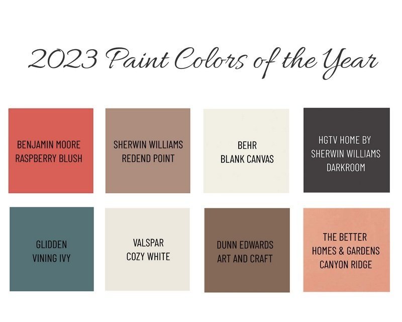
2023 paint colors of the year.
Every Fall paint manufacturers present their color forecast and announce their representative color for the upcoming year. Each paint company spends hours researching and observing the current cultural climate resulting in colors symbolic to it.
Let’s check them out!
Color forecasters are predicting palettes chosen for their distinct presence and personality. 2023 is a year of adding individuality to your space and discovering the transformative power of paint with hues inspired by modern art, natural changes that occur in metal, and a desire for self-expression through color.
Here’s the breakdown of the top three paint manufacturers…
Sherwin Williams
Sherwin Williams announced their color for 2023 is Redent Point SW9081. Warmth, intrigue, calming, and versitile are some of the adjectives they used for their paint color selection. SW embraced the spirit of connection with the world around us with this soulful-yet-subtle hue. This minimal yet cozy color creates a comforting backdrop for everyday moments that matter. Here’s to softer spaces!
Benjamin Moore
Make room for a vivacious shade of coral tinged with pink, Raspberry Blush 2008-30 has been named the Benjamin Moore Color of the Year 2023. Enlivening the senses, Raspberry Blush encompasses an electric optimism and is the definition of charismatic color. BM is unapologetic with their choice of red-orange and I personally love it! They had me at a hue that makes a statement! BM drew inspiration from artists desiring to communicate through color, shape, and sound as well as giving individuals a platform of self-expression.
Seeing Red? I put together this vision board featuring the colors of year chosen by Sherwin Williams and Benjamin Moore. They both selected red-based pinks. I think these story boards showcase the personality and versatility of each color. Which do you prefer?
Behr Paint
A much calmer selection, Behr’s 2023 color of the year is Blank Canvas DC-003. Paint forecasters have said over the past few months that consumers are moving away from stark white walls and instead crave warmer beiges. Blank Canvas does not disappoint! As a neutral color, it creates a warm and welcoming atmosphere. This paint color can be used in virtually anywhere… entryways, hallways, main living spaces, in bedrooms, or even on kitchen cabinets. This neutral color offers a comforting appeal yet creates a fresh feeling.
Did you know that you could boost your home’s selling price by over $10,000 with a select few statistically proven paint colors?
I offer FREE 30-minute Paint Color Discovery Calls to help you choose paint colors that work with the architectural style of your home, your fixed elements, and your specific design style!
Fresh Take Log Cabin
Lakefront Airbnb gets furniture makeover.
From Cheeky Tropical Beach Decor to Updated Lakefront Comfort
A fresh take on a log cabin Airbnb.
This 1980s log cabin is nestled in next to Lake Norman in North Carolina. The peaceful surrounding environment invites guests to vacation here and to enjoy all that the lake has to offer.
Redesigning the furnishings for this Airbnb was a huge undertaking because the cabin has so many different wood tones to work around. The other main challenges for this redesign were staying true to the architectural style of the home and working with some of the existing furniture pieces. My client and I wanted to elevate the decor yet keep in mind that everything needed to be affordable, comfortable, and practical for short-term renters.
Renewed Details
Upon their arrival, guests are welcomed to their vacation home with a whimsical wooden arrow sign pointing vacationers toward the lake. Fresh new pillows and a new doormat greet them before entering.
The Biggest Transformation
I personally feel that the living room has undergone the biggest transformation. We took The Golden Girls vibe out of this house and inserted a polished yet relaxed atmosphere.
Living Room Before
Side note: I had a very difficult time trying to donate this furniture because I was told: “it was too ugly”! LOL
Living Room After
For the size and shape of the living room, I chose a more proportionately sized sectional that now allows for a better functioning conversational space. Before, the sofa and four chairs were uninviting and made the room feel closed off.
I included a new natural sisal rug layered with an outdoor area rug on top. In a short-term rental scenario, outdoor rugs are more practical in heavy traffic areas. They are easy to maintain and will stay looking nice after many guests have come and gone. It was an added bonus that I could reuse the blue rug found in another room.
New accessories, artwork and throw pillows tie together the blue and white color palette that can now be seen throughout the home.
Depending on the time of day, the two-story open living room can be very dark, so adding a table lamp was a necessity. Not only does the lamp add additional lighting, but the overall style of the lamp and the color white also make it stand out and add much-needed contrast to the wooden walls.
I added faux plants wherever I could to bring nature inside and liven up the interior. Before, the only plants to be found were the pink and green floral prints on the chair fabric, tropical leaves on the rugs, and the floral prints on the wall decor. Live plants would be ideal, however not practical in a short-term rental space.
Don’t Fight It… Work With It
This kitchen has four different wood tones going on! The walls and floors are two different wood tones and then the island is a different wood tone than the wall cabinets! Ay, ay, ay… It wasn’t in the budget to make any cosmetic changes, so I had to figure out a way to work with what was there.
Kitchen Before
Hot Tip:
The log walls in this cabin all have an orange undertone making the walls the bossy main fixed element. By establishing what the bossy fixed elements is, I then determined blue to be the best color to work with this orange tone instead of fighting against it. Orange and Blue are directly opposite each other on the color wheel creating a complementary color scheme. When you choose complementary colors on the wheel, the warm and cool hues play off each other, producing palettes that enjoy the best of both worlds.
Kitchen After
If you notice we kept the blue and white knobs on the kitchen cabinets and drawers. Since this color palette was established, I ran with it and sprinkled blue and white throughout the house to create cohesion. We could have changed the cabinet hardware for something more modern and sleek, but the knobs are a little quirky just like this house!
We did, however, swap outdated light fixtures for these beauties! The elegant glass shape adds a sense of sophistication to the room. I restyled the open shelves and we purchased new industrial-style counter stools to tie in the matte black metal from the light fixtures.
Black and Bold
Before, the dining room was very uninspiring with the outdated dining set. The dining table and chairs were the same wood tone as the walls, which looks washed out and very dated. The dining table almost disappears into the sea of brown.
Dining Room Before
Now making a bold statement, this chic black table paired with matte black metal chairs is more pronounced.
Dining Room After
I love the metal stud detailing on the edges of the tabletop and the table base is so amazing!
That View Tho!
The view from this Sitting Room is breathtaking!
Before this space was underwhelming and honestly, I can’t get past the tropical print on this furniture to even appreciate the view of the lake!
Sitting Room Before
Sitting Room After
The oversized map of lake Norman was unique so we kept it where it was.
Blue accent chairs paired with a leather loveseat offer needed texture and color to this space. A faux fur throw blanket, bright white pillows, a colorful area rug, new sculptural wall art, and small decorative items take this space up to the next level.
Bedroom Styling
This cabin accommodates up to 15 guests. Ensuring guests have everything they need for a comfortable stay is a must when it comes to short-term rentals.
In an effort to save money, we kept and reused much of the furniture that was in the bedrooms. We did, however, update most of the beds with new mattresses and bed linens.
Primary Bedroom
Originally this bedroom had a California King-Size bed. The room is large enough to accommodate this bed size, but I wanted to better use the space and create a more comfortable seating area, so we changed the bed to a King-Size.
Primary Bedroom Before
Primary Bedroom After
I was able to move two bookcases from the basement up to this room to use as nightstands. I found these sleek leather X-base benches for the foot of the bed which tie in the new black metal headboard.
I built my color palette around the existing rocking chair fabric which was in great condition. I purchased a new area rug, throw pillows, blankets, artwork, and accessories. The lamps came from another bedroom and I think they work great in this space.
Secondary Bedrooms
There are three guest rooms on the second floor and one more located in the basement.
In this first bedroom, I updated the bedding and used large Euro-size pillows to make up for the lack of a headboard. I incorporated nautical elements through the rope detailing on the lamps, oval mirror, clock, and coral throw pillow.
Bright white bedding freshens and brightens up the otherwise dark room.
The smallest out of all the bedrooms is also the darkest. I selected soft light blue bedding that has a slight sheen to it to help reflect light. Details like the embroidered “Welcome” pillows and plush area rug soften the space and create a more inviting atmosphere. Light-colored artwork also helps to break up all of the dark wood on the walls.
Bunkbed Rooms
We decided to keep all of the bunkbed frames. They were in great shape and only needed a little updating.
I liked the colorful nautical decor that was already in this room. I thought it was playful and perfect for younger kids. I added bright yellow clamp on reading lights and fleece blankets to each bed.
This white coffee table was originally in the living room serving only as a place for the internet and cable electronic boxes to sit. By moving the table to this bunkbed room and adding adorable poufs, young guests now have a play table area.
Creating a more sophisticated yet cool hangout space was a must. Updating the bedding in the basement bunkbed room allowed me to design a space better suited for teens.
I liked the leather settee that was there. To update the look though, I added textural faux fur throw pillows, a rug with a trendy boho pattern, and an interesting coffee table. Each bed now has updated more mature bed linens, a soft fleece blanket, and a reading light.
Game On!
The garage space already had so many games and activities in it, but it felt cluttered and incomplete.
Game Room Before
We added two arcade games and for an added pop of color on the walls, I chose four adventure-themed movie posters from the 1980 era to speak to the time when this house was built.
Game Room After
The garage space is ready for guests to spend some quality time together!
All the Amenities
Enjoying the lake is only one of the great outdoor activities to do in Lake Norman.
I liked how this house has a fire-pit, built-it horseshoe game, basketball hoop, and of course the dock with a paddle boat.
Jump in and make a splash!
This Airbnb has it all.
Plan Before You Plunge
To show my client design concepts, I used my eDesign platform to create renderings so they could see my vision.
Every design should have a vision or mood board. It isn’t possible to fully put together a cohesive look without planning ahead and seeing everything put together.
Interested in staying in this cabin for your next vacation?
Planning for your own Short-Term Rental?
Download a FREE copy of our Short-Term Rental Checklist for all of the necessary guest accommodations.
2022 Paint Colors of the Year
2022 colors of the year.
Every Fall paint manufacturers present their color forecast and announce their representative color for the upcoming year. Each paint company spends hours researching and observing the current cultural climate resulting in colors symbolic to it.
Are you ready to go green?
Color forecasters are predicting varying shades of green will trend in 2022. According to forbes.com, “the shades of green we will see inspires us to begin again and is a great choice for modern interiors and exteriors”.
Green is such a versatile color that reflects the reality of the worldwide pandemic we’ve all gone through over the past year. A color associated with healing a growth, it’s no wonder why green has been chosen for the color of the year.
Here’s the breakdown from the top three paint manufacturers…
Sherwin Williams
Sherwin Williams announced their color for 2022 is Evergreen Fog SW9130. This green is more of a muted pastel with hints of grey than a classic sage. The color signifies the fog is slowly lifting as we await the newness of life with its soft green. The color is symbolic of gentle growth and slow emergence from what has become the new normal. Evergreen fog is subtle, calming, and creates a serene room in all styles of homes.
Benjamin Moore
Make room for creativity with October Mist 1495, the Benjamin Moore Color of the Year 2022. This gently shaded sage quietly anchors a space, while encouraging individual expression through color.
Behr Paint
Behr’s 2022 color of the year is Breezeway MQ3-21. The color is a silvery green, reminiscent of sea glass, inspiring us to embrace adventures near and far in the coming year. Breezeway evokes feelings of calm and a sense of renewal to discover newfound passions and a zest for life. It is a fantastic color to use in smaller rooms as cool pastels are perfect for expanding the perception of space and would be an excellent color to detail the home’s exterior.
Did you know that you could boost your home’s selling price by over $10,000 with a select few statistically proven paint colors?
I offer FREE 30-minute Paint Color Discovery Calls to help you choose paint colors that work with the architectural style of your home, your fixed elements, and your specific design style!
Why Stage in a Seller's Market?
6 Reasons to Stage During a Sellers Market
In a hot seller's market, home staging is just as essential as ever.
How do you know if your market is a "seller's market?"
“A seller’s market is when there are more homebuyers looking to purchase a home than actual houses listed for sale. A seller’s market usually results in rising home prices, stiffer competition, and increased bidding wars among homebuyers.” -Redfin
Even without staging, houses are spending far fewer days on the market. But staging is not just about getting a home sold quickly.
Home staging creates an emotional connection for the buyer. Falling in love with the home is especially important in a seller’s market in order to make the highest possible profit on every listing.
The Staging Studio put together a list of reasons why it is essential to stage in a Seller’s Market.
6 Reasons Why You Should Stage in a Seller’s Market
Even in a hot real estate market, home staging is essential. Here's why!
Regardless of where the real estate market stands, staging is a crucial part of the selling process.
Homeownership is probably the largest investment people will make in their lifetime. By creating spaces that buyers fall in love with, the negotiating power stays on the seller's side throughout the buying process. Don't leave money on the closing table!
Birkdale Bungalow Styled, Listed, Sold
Owner-occupied home staged in Huntersville, NC sells for $25,000 over asking price.
I recently had the pleasure of staging an adorable bungalow home situated in a thriving metro Charlotte, NC neighborhood called Birkdale Village. While the real estate market continues to be HOT, it’s no surprise that this home sold so quickly! The home was listed on a Friday and went under contract the following Wednesday with over 12 offers resulting in a sale of $25k over asking price!
First Impressions
Vibrant plants and a comfortable seating area on the front porch set the tone for this home. The front of the home is the first thing viewers see online and in person. Make a lasting first impression by doing the hard work of pressure washing your home, trimming shrubs, maintaining the yard, and adding a fresh coat of paint to the front door if it needs it! Add an updated doormat and you’re set.
Outdoor Oasis
Outdoor living spaces have significantly grown in importance to buyers since the pandemic. A tranquil retreat is at the top of most buyers must-have lists and should not be an area to skip over when staging your home for sale. For continuity, add pops of color that relate to the interior decor in your seat cushions, pillows, and even decorative planter pots.
Reposition Furniture
Home Stagers have a trained eye to visualize how moving furniture into a different location can improve upon a rooms ability to emphasize the focal points. By repositioning some of the furniture in this Living Room, the homeowner and I were able to create a more streamlined and more inviting space. We cleared out unnecessary items and styled the accessories in order to draw focus to the fireplace. Additionally, we repositioned an armchair underneath the mirror to create a more inviting entryway.
Hang Artwork
It can be tempting to remove everything from the walls when gearing up to sell your home, but I highly suggest you don’t do this. In order for a house to feel like an inviting home, hanging artwork and mirrors will help make a house feel more homey and not so sterile and devoid of personality.
In this Living Room, family photos hanging over the sectional were replaced with a colorful canvas print found upstairs in another room. I love how visually interesting the rhinoceros is and how directionally, the rhino points towards the fireplace which is the main focal point of this living room. Relocating items you already have to a different location within the home instantly updates a space and achieves a more meaningful purpose.
Don’t Forget the Details
I am OBSESSED with this kitchen! Scandinavian meets Modern Farmhouse at its finest. So cute and so on trend!
What I love most about this kitchen is the mix of emerald green and white two toned cabinets. The gold cabinet hardware is a nice touch along with the butcher block countertops. The matte black faucet looks stunning against the bright white farm sink. Classic white subway tile with contrasting dark grout is always a look I love!
To stage the kitchen, we cleared everything from above the cabinets and hutch cabinets to create a clean undisrupted visual site line. The homeowner is an avid tea drinker so to add a playful touch, we set out a white tea kettle and tea cups which looks great on the butcher block. Bright yellow lemons add an extra pop of color and freshness to the room. The hutch shelves were restyled with accessories the homeowner had on hand, and we were in no shortage of plants in this home! I couldn’t have been more happy with how we were able to bring the outdoors in and accessorize with so many beautiful plants.
Bedroom Styling
Styling this bedroom was a lot of fun! The homeowner already had the white bedding and some brightly colored accent pillows. Since there was no headboard, we added much needed height to the bed with euro sham pillows. To give this room a more modern feeling, new lamps and a new nightstand were purchased. Editing down the unnecessary items on the floor and clearing the workspaces allowed us to create a bedroom that now looks and feels sophisticated.
Make It Memorable
Having memorable and exciting pieces throughout the staged home creates a memory for the homebuyer. Savvy home sellers realize that creating a “show home” environment will entice buyers. Going the extra mile and paying attention to every single detail will pay off in the end!
Why stage when houses are selling so quickly?
The short answer is to get more money!! Statistically, staged homes sell on average for 9-30% more than unstaged homes according to the 2020 RESA Study of Staged Homes.
Only 1 out of 10 people can visualize furniture in a space. For this reason, it is critical to stage your home so that the vast majority of prospective buyers can visualize themselves living in the home.
This homeowner did the hard work needed to sell quickly and for top dollar. Are you ready to do the same?
FREE Real Estate Staging Consumer’s Guide
Want all the tips on how to make most out of your Home Staging Investment?
Keep the Clutter Away... the IKEA Way!
Keep the clutter away… the IKEA way! Top 9 organizational products.
Top 9 IKEA Products to Help You Stay Organized
Whether you are preparing your home for sale or just need some organization in your life, IKEA is a great store to turn to for inspiration and affordable home organization products.
Blending form with function, IKEA has a long standing reputation for helping their loyal customers stay organized with simple yet unique, affordable, and trending solutions. Here are my top 9 favorites to help you stay clutter-free!
Snidad
I LOVE the Snidad basket! It is adorable, lightweight, and becomes a central place to store items like blankets or pillows. The beautiful craftsmanship makes this basket the perfect choice to use in an entryway or even in a bathroom to hold towels!
Lubban
Rattan has made a comeback! This trending material is a great way to invite nature in your home. I like this Lubban cart because it can be wheeled around whenever you need it. The cart could easily be used as a serving cart or even as a storage solution for your home office. The possibilities are truly endless with this stylish cart.
Hemnes
Is it a cabinet? Is it drawers?
You’re in for a surprise when you open up the doors to find double shoe compartments inside! This gem is not only a secret hidden shoe rack, but the top compartment could easily store your face masks, keys, and other daily essentials. Say goodbye to entryway clutter and hello to this space-saving Hemnes cabinet!
Lurpassa
My favorite part about these adorable baskets are that they are perfect for storing smaller items. The Lurpassa boxes would be great to use in a media stand, kids playroom, for pantry storage, or even for office supplies. Ikea really thought of everything when it comes to these little beauties because they are designed to be stackable!
Saxborga
Storing items in jars allows you to see what is inside the vessel making it easier to find what you are looking for. The Saxborga jars look great and are extremely versatile. The jars can be used individually, stacked or grouped thanks to the cork lids and tray that keep them in place. No matter where you use this collection, you’ll be able to effortlessly turn your everyday items into decor!
Skubb
If you are looking for an under the bed storage solution, the Skubb is for you! This box could also be used in a wardrobe or chest of drawers to help you organize belts, socks, scarves, ties, and jewelry. The handles on all sides make it easy to pull out and reposition however you want. The box can be folded flat and stored when not in use.
Signum
Tuck all those annoying cords away with the Signum. No one wants to see or get tangled up in dangling cords, so I like that Ikea came up with a simple solution for home offices. I could see this being used for entertainment centers too. The Signum collects your cables and cords together making it easier to keep your work area tidy.
Dragan
Bring some warmth into your home with these bamboo Dragan storage boxes. With their sleek clean lines, the boxes nestle into one another and keep small items at bay. They could be uses in a bathroom for makeup or hair accessories or if you are a crafter, they would be great for organizing your smaller craft supplies.
Kubbis
Maximize your vertical wall space with the Kubbis. Featuring seven hooks, you can hang all the things! Use this anywhere in your home, even in damp indoor areas like the bathroom. The wall hooks make for a great entryway storage solution for bags, face masks, or the dog leash!
Cut Through the Clutter
Ikea offers so many organizational products that I had a difficult time narrowing my list down to just nine! View all of my favorites, by simply downloading your own curated shopping list below.
Favorite Organization Finds At IKEA
Gain access to the curated list of our favorite Ikea organization finds sure to help you keep your home clutter free!
Need a little extra help with how to stay organized? Download a free copy of Three Steps to Less Is More and Loving What You Have.
I will walk you through how to let go of unnecessary processions that may be weighing you down.
Have a question about your home and want to chat? Schedule a FREE 30-minute Discovery Call with me.
Home Remotely Staged in Orlando, FL
Owner-occupied home staged in Orlando, FL during a pandemic sells in 4 days for 3% ($15k) above asking price.
Staging A Home During A Pandemic
The real estate market has been HOT even though Stay at Home and Shelter in Place orders have been in effect for months across the nation. People are eager to upgrade their home and current living situations to better suit working from home and remote learning. Not to mention, interest rates are at an all-time low!
Why stage when houses are selling so quickly? The short answer is to get more money!! Statistically, staged homes sell on average for 9-30% more than unstaged homes according to the 2020 RESA Study of Staged Homes.
Pictured below, I recently staged this former model home located in Orlando, Florida that boasts tranquil views of a gorgeous golf course. The homeowners originally listed their home in 2019, however, it sat on the market for over six months with multiple price reductions and only a few low ball offers.
After much consideration of making necessary updates and working through my Home Staging Action Plan, this house now looks and feels like a million bucks! Since I am based in North Carolina, the homeowner’s and I were able to utilize technology to work through the Staging Action Plan and collaborate on what needed to get done.
The home was listed on a Saturday morning and had multiple showings that same afternoon. After five offers which lead to a bidding war, the home went under contract in 4 days! This beautiful home sold for 3% over asking price!! I couldn’t be happier for the seller or the new buyer. #homestagingworks
In my detailed Action Plan, we began with all of the homeowner’s furnishings. This home was a classic case of having too much furniture so what we needed to do first was eliminate outdated and unnecessary furniture and accessories. Every room felt overcrowded and cramped. The homeowner took my suggestion to store the unused furniture in a storage unit. They were also able to sell many items on Offer Up.
After the furniture was removed we were able to really see the potential in each room and focus on architectural features. The furniture was repositioned so it best suited each space and leads your eye to focus on the positive features.
Next, we worked on depersonalizing the home and edited each room.
Memorable moments or strategically placed vignettes were created so that buyers can emotionally connect with the home. Savvy home sellers realize that creating a “show home” environment will entice buyers. Going the extra mile and paying attention to every single detail will pay off in the end!
A few modern accessories were purchased to help update the rooms.
HOT TIP: Bright white duvet covers, euro sham pillows, accent throw pillows, textured blankets, artwork, and other neutral tabletop accents are an easy way to update and bring life to a room.
A key room to always stage is the Owner’s Main Bathroom shown below. In this particular house, replacing the vanity cabinets and mirror were not in the budget so we opted to have the cabinets and mirror trim refinished in Sherwin Williams Keystone Gray SW7504. We gave the bathroom a fresh new look by painting the walls Sherwin Williams Agreeable Gray SW7029. The vanity light fixture and cabinet hardware were updated with chrome fixtures complimenting the other fixed elements in the bathroom.
Only 1 out of 10 people can visualize furniture in a space. For this reason, it is critical to stage your home so that the vast majority of prospective buyers can visualize themselves living in the home. Investing in professional photography will make your listing stand out online.
Don’t leave money on the table by not consulting with a Professional Home Stager when selling your home.
5 Steps to Effectively Design Your Home Office
Designing a home office in a way you love is actually pretty powerful. When you enjoy the space, you want to keep it tidy. A clean, organized workspace will help you enjoy your work.
What if working from home goes on forever?
As daunting as that may sound, remote work is surprisingly productive — leading many employers to wonder if they’ll ever go back to the office.
If you have been working from home and will continue to do so for the foreseeable future, it may be worthwhile to update your home office and make it work for you. Working in an environment that brings joy and inspires you will help you stay on task and contributes to greater productivity.
Follow These Steps When Designing Your Home Office
Do you already know what your personal design style is? Great! You are ready to skip ahead and follow our recommended five steps.
If you aren’t sure what your personal design style is, take my fun home office design style quiz at the end of this post!
No matter what your personal design style is, here are five steps to consider that will help you achieve a functional and aesthetically pleasing workspace.
1. Stay Organized
Before you stockpile organizational bins and file cabinets, put some thought into how you actually organize. If you already scan your receipts and keeps things digitally, why buy a filing cabinet? You have the flexibility of creating your workspace the way you need it. Do it in a way that will work for you long term.
2. Elevate Your Thinking
Even the smallest home office can be fully stocked with great decor and organizational solutions. The trick is to think up. Maximize your vertical square footage by adding floating shelves or installing wall cabinets. Fill them with useful bins alongside colorful books or meaningful artwork.
3. Let There Be Light
Sufficient lighting makes work easier. We strain our eyes staring at screens most of the day. Don't make it worse by limiting lighting in your home office. Use natural lighting as much as possible, but make sure to supplement where it falls short.
A well-lit office is a happy, productive one.
4. Cut The Cord Clutter
One of the worst things about offices is all the tech clutter that accumulates. You probably need your computer and printer, but that doesn't mean you have to stare at cord tangles all day. Take steps to free your home of cord clutter. Mount a power strip underneath or on the back of your desk. Use cable ties and command hooks to wrangle any cords that get plugged into that power strip and feed them along the back of furniture out of sight. You'll be amazed at how removing that eyesore of cords will make your office feel clean and bright.
5. Make Yourself At Home
Your office is an extension of your home. It should look and feel like one. Decorate with the same themes you've used in your house and incorporate items you love. Don't limit yourself just because this is a workspace. You'll be more productive in a room that brings joy, so why not put some extra care into creating an office that feels like home?
What is Your Home Office Design Style?
Find out now by taking this fun quiz.
Looking for some professional design advice for your home office? Schedule your FREE 30-minute Design Discovery Call with us.
Mid-Century Modern Living Room on a Budget
Tips to achieve the look of a Mid-Century Modern Living Room on a budget
With a fresh yet retro vibe, Mid-Century Modern never goes out of style. Unlike other aesthetic movements, Mid-Century Modern decor is streamlined in design, as form follows function while highlighting the materials used, rather than making them something they aren’t.
Achieve the Look
Even on the tightest of budgets it is possible to achieve the retro look and feel of Mid-Century Modern design, and I’m going to show you how.
In the example below sourced from Bassett Furniture, streamlined furniture juxtaposed with natural elements highlight a mixture of natural finishes, cool black tones, different textures, and varying metallics. I totaled up the main components of this room, and to purchase everything pictured directly from Bassett, you are looking at spending upwards of $7,000. For some, this price tag is a non-issue. As for the rest of us, we would need to take some savvy shortcuts to achieve this look.
On a Budget
Luckily for you, I went ahead sourced a much more budget-friendly version of the same inspirational room. The foundational elements are still there, but come with a much smaller price tag.
First and foremost, if you are considering updating your living room in any style, I would recommend that you do place a bulk of your budget into investing into pieces like the sofa or coffee table that will get the most use. Investing in quality pieces will give you peace of mind that they will withstand day to day wear and tear. Accent furniture is easily replaced once they’ve seen better days or you just tire of the look all together.
Sofa
In my Budget-Friendly version I found the strikingly streamlined gray Lyman Sofa from Ashley Furniture for a fraction of the price of the inspirational sofa.
Accent Chairs
AllModern.com is my go to source for all things Mid-Century Modern. I found the Siddhesh Armchair with an authentic retro finish and unique open-framed arm design for $490 each.
Coffee Table
I swoon over the inspirational coffee table duo! The organic shape and visual weight the two tables add to the example living room are spot on. After tirelessly searching for a suitable dynamic duo with a more reasonable price point, I came up short. My solution though is this tapered Kaylah Coffee Table in a beautiful wood tone. I think this table would add the same visual weight and interest as the table in the example, but at a much more reasonable price. Serving as an investment piece, the alternative coffee table I found would be a splurge item in this scenario.
Side Table
I love, love, love the organic Tori Side Table that I came across on AllModern. I think I love it even more than the round table barely visible between the two accent chairs in the example photo! I would also recommend repeating a similar wood tone as the coffee table to bring natural warmth into the space.
Cow Hide
Use an area rug whenever possible to ground the seating arrangement. In the example photo the gorgeous natural cow hide area rug adds a layer of soft texture on top of the natural jute area rug. Cow hides can be very expensive though. An alternative to a natural cow hide rug is the Faux Cow Hide Rug which is soft plus easy to maintain.
Mirror Mirror on the Wall
A 48” diameter mirror would make a dramatic statement in any room! The example mirror has more of an oil rubbed bronze finish which is quite nice, however I think I would repeat the black finish found on the frame of the accent chairs. I sourced an elegant black metal framed Eternity Mirror which costs roughly $230, a steal considering the large scale of the mirror!
Pillows
Throw pillows have a way of tying a room together. You can easily add pillows that are understated or whimsical. If you purchase quality pillow inserts, you can swap out inexpensive pillow covers seasonally or however often as you like. In my budget-friendly comparison design, I opted for black pillow covers with modern white stripes from Woven Nook. I think it is important to mix things up a bit and make the design work for the end user.
I’d love to hear your thoughts on how my budget-friendly Mid-Century Modern living room design measures up to the inspirational room?!
Staging a House on a Budget - Lenko Design Featured on Redfin Blog
Originally Featured on Redfin
I was so excited when I was contacted by Redfin to be a featured home stager in their “Staging a House on a Budget - Tips From the Experts” blog! With so many great budget friendly tips to share, I had a difficult time deciding on just one low-cost staging tip to share. I finally decided to share advice for easily staging bathrooms because so often the bathrooms are ignored.
The Main Bathroom really is a key selling feature and should be treated as such. A crisp, clean and soothing bathroom will invite Buyers’ in and give off a spa-like ambiance. White fluffy towels rolled up or nicely folded in a stack near the tub remind Buyers’ of relaxing in a hot bubble bath and melting the stress of their day away.
To read the complete list of budget friendly tips from other staging experts click the link Redfin.
Staging Essentials for Quick Home Updates
Home Staging Essentials to quickly update your home.
Products Every Seller Should Buy
Modernizing is a key element in home staging and the most effective way to modernize a space is to add some key staging accessories that help to update each room. Usually after the home staging consultation I will create a home staging props shopping list for the seller. I recommend seller’s to purchase items that will go a LONG WAY in updating the home and attracting the best offer possible.
To make things easier for any seller planning to put their house on the market, I have curated a 6-page shopping list of essential home staging props.
Everyday Decor
What room can't benefit from a large jute rug, fresh new pillows, more lighting and fiddle leaf tree?
These simple, yet updated staging accessories are usually the missing piece in a living space. Make sure to go large on the floor rugs, so that every front leg of your furniture touches it.
Amazon is my go-to place for awesome pillows, so have fun exploring for that perfect, pillow combination.
Entryway Accessories
Every home can benefit from a new doormat, attractive vases, mirrors, and serving trays (find out why I love serving trays so much in my blog post all about trays).
The 37-inch circular mirror can work in any home and multiple spaces to add additional light, use over a fireplace, in an entryway or go over a bathroom vanity. At $140 from Amazon, this mirror has over 500 five star reviews!
The large jute storage baskets are another extremely versatile item that can add much-needed texture to any space for a mere $30 bucks on Amazon.
Kitchen Essentials
Most kitchens lack warmth and personality because they are filled with hard finishes. Never clear every counter and try and sell a bare kitchen! Since the kitchen is a huge selling opportunity for the home seller it becomes even more critical to carefully stage counter vignettes that add texture and warmth.
I personally love the look of cookbooks sitting upright on a kitchen counter, a bowl of fresh fruit and brand new woven dish towels or table runner. White accessories denote cleanliness, so using white home staging props will help to make the clean connection for buyers. These small, inexpensive additions go a long way in creating a clean, natural atmosphere.
Bedroom Basics
Bedrooms are so personal, that it can be discomforting walking into another person's boudoir for a buyer...especially if the bedding is old and tired looking.
Adding white bedding enlarges the space and gives it a fresh, clean feel in any bedroom.
Bathroom Essentials
Bathrooms are similar to bedrooms in that they are intensely personal, so using white and having it immaculate will never scare off buyers. Use a serving tray to anchor a vignette on the counter. Fresh white, fluffy towels stacked by the tub and greenery gives the space that spa-like feeling.
Coffee Table Vignette
Building beautiful vignettes or what I call "emotional connection points" in each room of the home takes an extreme eye for design. I built a perfect coffee table vignette that is easy for you to purchase and build on your own.
Find this along with all of the other products in our 6-page curated Shopping List.
Quick Updates Help Sell Homes
Even if you are selling your home on the tightest of budgets, these many items valued in total at around $1250 will make a $12,500 difference in the value of the home.
Buyers are looking for stylish decor and statistically will pay more for homes that have updated decor, so spending a bit on these versatile accessories will be an investment in the sale of the home. Not to mention, you can reuse them in your brand new home!
#homestaging #homedecor #essentials Source
Want even more Quick Update Ideas? Check out Best Sellers from Amazon.com.
Download a FREE copy of this curated shopping list filled with our go-to Staging Essentials that are sure to quickly update your home.
This includes 6-pages worth of shopping links!
Serving Trays - Gorgeous, Affordable Styling Ideas
Serving Trays are a must when it comes to styling a home for sale. This versatile home accessory can serve so many functions and complete the look of a room.
Serving trays are a great accessory that is versatile in so many rooms. Not only practical for serving your favorite foods on special occasions, but also serve as a decor piece to spruce up your coffee table, have breakfast in bed, or can be used in the kitchen or even in a bathroom. Here are some examples of beautiful serving trays that can be used in Home Staging or Redesign.
Serving Tray Stylizing Ideas
Below are some of my favorite ways to stylize serving trays. Whether you are creating a vision for a potential buyer by strategically placing decorative items or simply adding decor for yourself, serving trays offer so much flexibility you are bound to find some inspo for your own home!
Everyday Styling
Natural wooden serving trays add warmth to any space. Accessorize with a few stacked books, your favorite coffee mug, a gorgeous vase with fresh flowers and you are all set!
When accessorizing, remember to use the styling Rule of Threes: High, Medium, Low.
By using varying heights of decorative objects, you are adding visual interest.
Living Room Essentials
Magazines that speak to your demographic are a personalized touch that won’t go unnoticed when staging your home for sale. Taking the extra step to include natural objects such as seashells speak to where your home is located and creates a vision for potential buyer’s to envision themselves taking a trip to the beach.
Bathroom Indulgence
When preparing your home for professional photos to go on MLS, keep in mind that metallics photograph extremely well because they reflect light. In a bathroom, add spa-like items such as candles, fresh flowers, fluffy white towels, and natural wood elements. Doesn’t this example exude a luxurious and relaxing space?!
Bedroom Accessory
This example of a serving tray on a bed evokes a feeling of a cozy breakfast in bed. What a treat that would be?! Darling white coffee cups and a coffee pot pair beautifully with this rustic wood rectangular tray.
Kitchen Basics
Kitchens are the “heart of the home”. Staging a kitchen is imperative because buyers expect to see a clean, organized kitchen with special emotional connection points that draw them into visualizing themselves entertaining and cooking family meals. Create a true focal point by using a serving tray as a centerpiece. The tray will anchor the accessory grouping all together.
Seasonal Decor
Serving trays can be used all year round! Switch up your accessory groupings to coordinate with your seasonal decor.
Shop The Look
Serving Trays all less than $55
Do you have a serving tray? Do you style it or only use it for entertaining? I just bought one myself so I would love to hear your ideas!
#homestaging #homedecor
Why I Believe Home Staging Works
I was skeptical of home staging at first. Making a great first impression to potential buyers is critical.
I admit I was skeptical at first about home staging. I mean, can’t everyone walk into a space and visualize the appropriate furniture?! Nope.
The truth is that only 1 out of 10 people can do this. As a designer I have been trained to do this and when my husband and I listed our home for sale I asked our agent if she felt staging helped when selling homes. She confirmed that it in fact does. I was still feeling apprehensive, but I trusted her opinion.
Our selling situation was unique in that we had a time crunch to list our house due to a quick job relocation, so I got right to work. At this time I had watched enough HGTV shows that thought I knew enough about staging and all the house needed was to be clean, decluttered, and depersonalized. Since we began the packing process early we took down EVERYTHING from the walls so we could patch holes and touch up paint (I later regretted taking down artwork and generic decor). I styled our rooms and cleared out all personalized items.
Our house was listed and went under contract within 15 days! What a relief that was with such a quick turnover. It was at that moment that I became a believer.
Feedback from the open house we held confirmed what our agent told me about staging and she thought our house was staged wonderfully. Staging and receiving multiple offers and ultimately selling our home for more than asking price is what lead me to pursue Home Staging as a career. I want to share with other homeowners what I have learned along the way and how statistically spending 1-3% of the value of your home on home staging & upgrades will typically net you a 10% return in the sale!
I’m not here to tell you that if you stage your house it will in fact sell as quickly as mine did. There are a lot of external factors involved such as housing market trends, economy, the season of the year you are trying to sell, comparable homes in your specific area, and most importantly how realistic your listing agent prices your home.
What I can give to you are statistics from the NAR Profile of Home Staging Report:
Almost half (44%) of Seller’s Agents believe the staging increased the value of the home 6-20%.
Over 83% of buyers find it “easier to visualize the property as their future home” when it’s staged.
Absolutely NO (0%) of Seller’s Agents believe that staging has a negative impact on the value of the home.
After becoming an HSR Certified Home Stager, I now know the art form behind what true home staging consists of. I look at my MLS photos and critique where I could have improved upon our rooms. Remember earlier I said I regretted removing everything from our walls? This may be my overly critical side coming out, but I do now fully understand a buyers mentality. Buyers need to see furniture and accessories strategically placed to visualize living in a home.
Ninety percent of potential buyers are viewing homes online first and making a decision based on photos alone whether or not they want to even view the home in person. There is great power in professional photography! Once they decide to walk through a home, they are making an opinionated decision within the first 15 seconds. They cannot overlook things that need repairs. Carpet stains, cracked tiles, squeaky door hinges, outdated bathroom fixtures or even dirty baseboards are all things that scream RED FLAGS. A buyer’s mental to-do list will only grow bigger and bigger. A buyer cannot look past other people’s clutter. When they see this, they immediately think “this home doesn’t have enough storage space”. Don’t leave money on the table by not doing the hard work and fully preparing your home for sale.
Often sellers think that they can “stage their own home”. True they can, however, sellers do not have the ability to be objective of their homes. Until a seller can truly disassociate and view the home as a product, they won’t be successful with staging it to sell.
Benefits of working with a Professional Home Stager:
A professional Home Stager will be able to guide a seller on how to appropriately arrange furniture and accessories to fit the buyer demographic.
A professional home stager will implement techniques to evoke an emotional connection with the home.
A buyer needs to be driven emotionally in order to feel that “this house is the one”. That emotional tie will be the icing on the cake and lead to a buyer paying above list price because they will feel that they cannot live without purchasing that specific home.
I have been proven wrong. Cleaning, decluttering, and depersonalizing a home are not enough. Sellers have to invoke a lived-in feeling that a buyer will fall in love with. Staging works. Allow Lenko Design to guide you through the process.
Our expertise, your success.
SUBSCRIBE
Signup for our mailing list so you are always in the know!