My passion for interior design derives from helping people just like you solve design dilemmas. My hope is that I can inspire you through my own life journey and what I’ve learned along the way. Thank you for your support. -Tiffani
Design on a Budget, Inspo, Pro Tips, eDesign Tiffani Michalenko Design on a Budget, Inspo, Pro Tips, eDesign Tiffani Michalenko

Hallway Refresh

Hallway gets a refresh with board and batten and new wallpaper.

This dark dead-end hallway was boring and needed a refresh. Check out what we did to make this a more appealing and happier space!


The Before

Where to start with this dead-end hallway? The overall darkness, the chair rail, the awkward yet narrow walkway, or the lack of a linen closet…

I’ve always been bothered by the floor plan layout of this hallway. The angled wall to the right creates a very narrow walkway from the landing of the stairs. Since we aren’t changing the walls or layout of this space, I had to decide on what could be changed.


What We Did

We opted to remove the unnecessary chair rail. Chair rail has a place in dining rooms to protect walls from chairs being pushed up against the wall. Why the chair rail was installed upstairs in this hallway will always be a mystery to me!

We repaired the walls from the chair rail removal and installed board and batten.

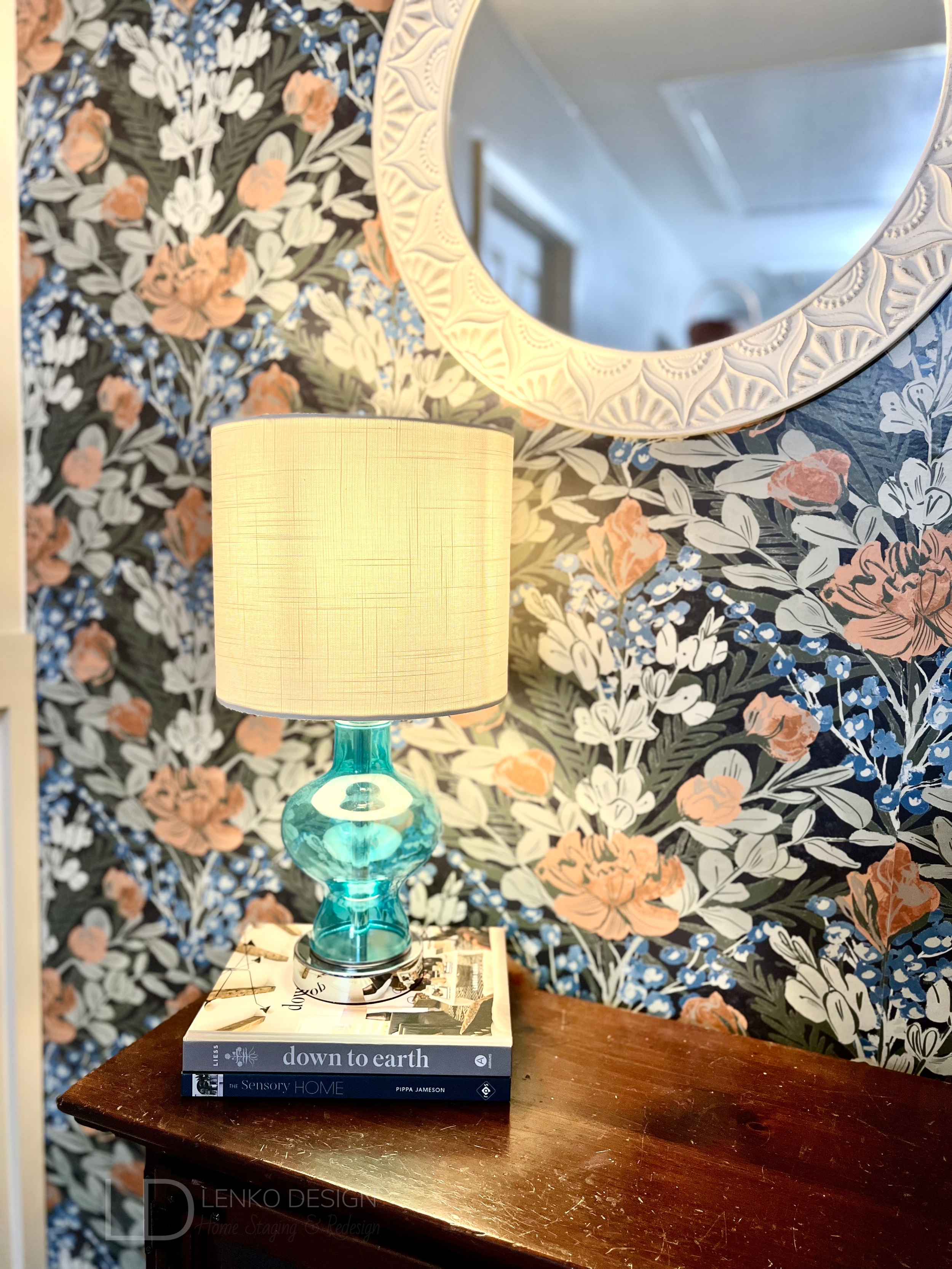
I found this gorgeous Dark Multi Moody June Blooms peel-and-stick wallpaper from WallPops. I loved the blue accent color paired with the different shades of green and tiny bits of orange.

This was my first time installing peel-and-stick wallpaper and it was fairly easy. I did find it a bit challenging to line up the patterns perfectly. I love it though and the print adds so much life and cheerfulness to this dead-end wall.

After applying primer to the wood, we painted a fresh coat of Sherwin Williams Agreeable Gray SW7029 paint on the walls. I opted to paint the board and batten the same as the original paint color as a way to color drench the space. The original white chair rail and trim stood out, and not in a good way!

It took me several days of sanding and fully preparing the walls to be primed and painted.

Once all the painting was complete, we moved our antique pie safe back into place. The blue cabinet which we use for linen storage, was the inspiration behind my selection of wallpaper, area rug runner, and table lamp.


HOT TIP: Find an inspirational piece to begin developing your design plan. This can be artwork, a pillow, an area rug, a pretty pattern on a dish… you can draw inspiration from almost anything! Your design plan will have a purpose once you do. You’ll know what colors or patterns you are drawn to and a clear direction of what you would like to try and incorporate into the space.

To help add some light to this hallway, I found this adorable blue glass table lamp on Amazon and the white wall mirror was on clearance at Hobby Lobby. The mirror helps to reflect light and also makes the hallway feel a bit longer than it really is.


The dark wood cabinet in front of the wallpapered wall has a lot of scratches on it. I’m considering stripping the dark stain and giving this old cabinet a facelift.

What do you think?

Paint the cabinet a light green or go with a more natural-looking wood tone. I’d love to hear your thoughts!


-Tiffani Michalenko

HSR Certified Home Stager & Expert eDesigner


Read More

Painted Cabinets

How to paint kitchen or bathroom cabinets.

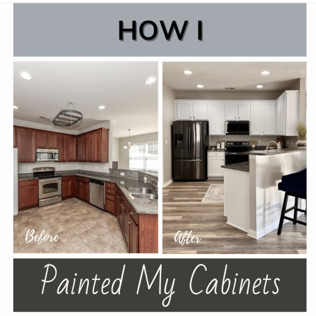
The overall aesthetic of my kitchen was mismatched and outdated. Since the cabinets and granite countertops are in great condition, we decided to paint the cabinets.

This is how I did it.


What You’ll Need

I used everything listed below plus some additional brushes I had and buckets to clean with.

Preparation

Step One:

I removed all of the doors and drawers from the kitchen. I took off the knobs, hinges, and clear sticker bumpers.

Step Two:

Once the hinges were removed, I used a Sharpie marker to write what number the cabinet was inside one hinge hole cutout. I then also labeled a piece of blue painter’s tape with the same number and stuck it on top of the number marked with Sharpie. I did this because when the paint was sprayed on, it covered up most of the labels on the painter’s tape. I was able to pull it off and see the numbers clearly for the installation.

I also made labels out of blue painter’s tape for each drawer.

Step Three:

I sanded the cabinet boxes, doors, and drawer fronts using 320-grit sandpaper wrapped on a sanding block.

I wiped everything down with a tack cloth and then using a paint rag, wiped with Liquid Sandpaper.

I then mixed the TSP All-Purpose Cleaner with warm water and wiped everything making sure to get any leftover sanding residue.

Be sure to wear heavy-duty protective gloves during this process!

Hot Tip: Use a hair dryer to heat any sticky residue and scrape it off with a palette knife or flathead screwdriver.


Step Four:

Prep your workspace. Place painter’s plastic down on the floors and on top of countertops to protect from paint spills or drops.

Using the Green Frog Tape, tape all areas where the cabinets meet the walls, floors, appliances, countertops… everywhere you don’t want paint. Be sure to tape two layers side by side. Doing so will make it so that the edge of your paint roller goes on the tape and not the wall.

I taped painter’s plastic on the interior of my cabinet boxes to protect them from unwanted paint splatter.


Applying Primer

Step Five:

Cabinet Boxes

I painted two coats of Zinser BIN Primer on the cabinet boxes. The primer is very thin and smells awful. Make sure you ventilate your room as much as possible.

For the cabinet boxes, I cut in using the 2” flat brush and rolled on the paint everywhere else.

Door and Drawer Fronts

When I primed the doors and drawer fronts, I used the paint sprayer. It was much faster and only required one coat of Primer. The downside was that the paint sprayer used up a lot of Primer. I ended up going through an entire gallon.

I first painted the backs of the doors and drawers. If I made any mistakes or the paint dripped, it was on the back and less noticeable than on the front.

HOT TIP: Wear a properly fitted face mask, eye covering, and gloves when using primer.

I used the mini cone paint stands to prop the doors and drawers up on as they dried.

Once the backs were dry, I painted the fronts and sides and then let them dry.

HOT TIP: I learned that once dry, the Primer dries flaky on the painter’s plastic and painter’s tape. I had to use a lot of tack cloth to get the flakes off before I could paint with the cabinet paint. I probably should have removed the painter’s plastic and then prepped it again with fresh plastic and tape.


Applying the Cabinet Paint


I chose the Nuvo Cabinet Paint because it is easy to work with plus the kit comes with everything you need to get started. Nuvo has several colors to pick from and I really liked that they included very detailed instructions.

I used the Nuvo Cabinet Paint on my bathroom vanities without the top coat that can be purchased separately and the paint has held up very well. I do plan to go back and put a top coat on them just to make sure the paint lasts even longer.

Step Six:

Cabinet Boxes

Using the same method as with the Pimer, I cut in with a 2” brush and rolled the paint on with the cabinet paint roller. I found the Nuvo Titanium White paint to be very thick but applied smoothly.

I didn’t take a picture of this step, but I used the drywall knife to avoid paint bleeding through the painter’s tape onto the flooring. I put the flat edge of the drywall knife on the floor up against the shoe molding and painted on top of the knife instead of painting directly onto the painter’s tape.

It took two coats of cabinet paint to fully cover the Primer. I repeated the painting process with one layer of the Clear Top Coat.

Drawers and Doors

I used one of my daughter’s toy bins that has wheels on the bottom to easily rotate the doors and drawers around while I painted them.

I started with the backs again. I first cut in with a brush and then rolled on the paint with the paint roller.

After the backs were dry, I repeated the process for the fronts.

I let all of the doors and drawers dry overnight and then repeated the process of applying the Clear Top Coat.

HOT TIP: Remove the painter’s tape while the paint is still a little bit wet. This will allow for cleaner edges.


Putting It All Together

Step Seven:

Inspect your paint job to see if there is anywhere you need to touchup, then replace the clear bumper stickers on the backs of the doors and drawers.

Step Eight:

I enlisted the help of my husband to help reinstall the doors and drawers. We replaced the hinges with new soft-close hinges and hung the doors back up.

After the drawers were put back, we installed new knobs and then we admired all of the hard work that went into this transformation!


I am so glad we decided to paint our cabinets! It was a labor of love and definitely took me longer than I anticipated. I think the most time-consuming part of this project was the prep work, but it was necessary to achieve the results I wanted. All in all, this project took me over two weeks to complete. I worked a little bit every day and did what I could while my kids were at school.

Now we have a fresh bright white kitchen that instantly brightened up the entire space!


FREE download! Start planning your next home refresh with this Room Budget Calculator.


-Tiffani Michalenko

HSR Certified Home Stager & Expert eDesigner


Read More

Out With The Old… In With The Newly Refreshed Kitchen

An outdated kitchen gets a fresh coat of paint.

When we purchased our house in 2020 we knew that the Kitchen would need a facelift. The layout is perfectly functional, but the overall aesthetic was mismatched and outdated.


The Before

The layout of the Kitchen works for us, but the reddish brown cabinet stain and pink beige tile felt outdated and clashed with the black and white granite countertops.

The hanging pot holder served no purpose and was crooked and off-center. When we removed it, we found out the hanging pot holder wasn’t even secured to a ceiling joist! Thankfully we never hung any pots from it.


The Flooring

The flooring had to go! The pink beige builder-grade tile was chipped, cracked, and clashed with the black and white granite countertops.

With kids and pets, we ultimately decided to install a wood-look LVP (luxury vinyl plank tile) throughout our first floor due to its durability and water resistance.

When installing this type of wood look flooring, it is important to try and run it continuously throughout. Never try to install the flooring up to another type of wood pattern. It will not ever look right because the wood tones will be different and you could timestamp your house.

BEFORE

Do you see how awful the installation was? The previous owners of our house installed LVP next to the old tile. The tile is much thicker than the LVP so we constantly stepped on the “ledge”. Plus, they didn’t bother removing the tile that created a pointed angle that butted up to the column. It drove me nuts that the point was not centered on the column!

AFTER


The Walls and Cabinet Paint

We painted the walls and ceiling with a fresh coat of paint. The walls are Sherwin Williams Agreeable Gray SW7029 in a satin finish.

The reddish brown cabinet stain represented the Tuscan trend from when the house was built in 2008. The cabinets themselves were in great condition so we opted to paint the cabinets a fresh bright white. We also replaced the cabinet door hinges with soft-close hinges as well as replaced the knobs.

Want to find out how I painted my cabinets? See more here.

The appliances were replaced with a matching set and we swapped out the sink faucet for a taller spot resistant brushed stainless steel sink faucet from Moen.

The Result

The Kitchen now feels brighter and makes the entire space feel even more spacious!


What do you think about this Kitchen Refresh?


FREE download! Start planning your next home refresh with this Room Budget Calculator.


-Tiffani Michalenko

HSR Certified Home Stager & Expert eDesigner


Read More
Design on a Budget, Inspo, Pro Tips, eDesign Tiffani Michalenko Design on a Budget, Inspo, Pro Tips, eDesign Tiffani Michalenko

Pantry Refresh

An organized pantry equals easy access to food and cookware plus an immense feeling of order.

Pantry Goes From Dysfunctional to Completely Organized

Holy pantry space! This oversized pantry recently got a facelift and I’m here to share with you how we did it. 

pantry before after.png


The Before

Disorganized and cluttered, things fell through the wire shelving. A very frustrating space that made me feel overwhelmed every time I walked in.

Disorganized and cluttered, things fell through the wire shelving. A very frustrating space that made me feel overwhelmed every time I walked in.

When my husband I bought our house we were shocked at the size of our new pantry. We’ve only ever had a small closet space to use. This pantry could easily fit bunk beds LOL! 

The drab basic builder-grade white wire shelving was over twelve years old, dirty, stained, and not functional for adequate food storage. The vertical posts made it challenging to organize food and the open shelving caused things to fall through the cracks all the time.


What We Did

First, the wire shelving was torn out and the many, many holes left in the walls were patched. 

We painted a fresh coat of Sherwin Williams Agreeable Gray SW7029 paint to the walls and I worked on the staining and adding a coat of Polyurethane to the wood shelves my husband cut and sanded. I used the Dark Walnut #2176 stain finish by Minwax.

The shelves vary in length according to the wall-length but are all right at 11” deep.

We spaced out all of the brackets and fit each shelf. This required us to trim some of the wood so it was a perfect fit.

One by one we spaced out the brackets determining how much height we wanted between shelf levels and the shelving space came to life. We maximized every square inch in this space!

Pantry Measurements.png

Once all the shelves were up, the room overall felt more open and spacious, but the dark wood tone absorbed much of the light so we decided to also update the semi-flush mount light.

Voila, instantly more light! 

pantry light.png

The fun part began with a shopping trip to IKEA where I was able to source most of the storage bins. I found the clear bins on Amazon. You can download a free copy of all the products I used here.

I organized all the food and made my own vinyl labels with my Silhouette cutting machine.

You could certainly download free printable labels and print them on sticker paper or use a marker and handwrite them!


All Done

pantry after.png

Everything now has a place and I couldn’t be happier channeling my inner KonMari!  


What do you think about this Pantry Refresh?


FREE download! Shop my favorite organizational products used to accomplish this Pantry Refresh.


-Tiffani Michalenko

HSR Certified Home Stager & Expert eDesigner


Read More
Design on a Budget, Inspo, Pro Tips, eDesign Tiffani Michalenko Design on a Budget, Inspo, Pro Tips, eDesign Tiffani Michalenko

Farmhouse Bedroom Designed Four Ways

We’re seeing Farmhouse design everywhere! Is this style here to stay? We designed a bedroom with four different variations of farmhouse style.

Farmhouse Style. Is it here to stay?

I recently went shopping at The Depot at Gibson Mill which is an Antique Mall located here in Concord, North Carolina. It is a fabulous place to visit with oodles of vintage and antique booths. One of my happy places! 😊 I am a sucker for unique vintage finds!

During this trip, I was inspired by the aged furniture, all the patina you could ever imagine, and mostly the surplus of farmhouse decor.

As we perused the aisles, I was so inspired that I found myself placing pieces of furniture together in my mind and imagined a farmhouse-style bedroom situated in a cozy old home somewhere deep in the country. 

That leads me to question if the Farmhouse Design Style is here to stay


After I got home I dug deeper into this thought and realized that the term ‘farmhouse’ is loosely used to describe a design trend that is so much larger than its name. 

“Defined as an interior design style, farmhouse is a style that draws inspiration from the look of an actual farmhouse and uses decorative elements that you’d find in rural or agricultural areas. Farmhouse interiors are warm, cozy, relaxing and full of charm and character.” -Modsy 

The style takes me back to “simpler” times. It is easy though to veer the look into too much “country kitsch”, so it’s important to maintain a stylish balance of old and new, focusing more on a natural look. In other words, farmhouse design isn’t code for going overboard with the mason jars, shiplap, cotton stems, and collections of rooster statues!

I further discovered that there are many variations of farmhouse design and how each has its own distinct characteristics.


The farmhouse interior design style can be seen all over HGTV shows, Pinterest, Houzz, and Instagram feeds. The most popular forms of farmhouse style are Classic Farmhouse, Rustic Farmhouse, Modern Farmhouse, and Victorian Farmhouse.

After reading more about each individual style, I categorized my antique mall findings as Classic Farmhouse. 

I developed a bedroom mood board based on my shopping adventure. 

Classic Farmhouse

A more traditional style with “French provincial” aesthetic influences, Classic Farmhouse is a softer, more feminine approach to farmhouse style and creates that classic cottage chic vibe.

After creating this concept board, I decided I needed to challenge myself to create more versions of the bedroom in each of the most popular farmhouse styles. 


Rustic Farmhouse

This style is a less mid-century and more rustic/industrial take on farmhouse design. It has a heavy focus on rugged materials—like rough-hewn and natural woods, wrought iron, and leather with a rich patina—along with more vintage and antique pieces.


Modern Farmhouse

Modern Farmhouse effortlessly blends the best parts of some of the most popular trends from the past several years—you’ve got a smidge of Rustic, a dusting of Industrial, and just the right amount of Mid-Century Modern design. It instantly adds a casual-but-pulled-together character to any interior. While this style is a bit more dramatic than your typical rustic or classic farmhouse look, it still manages to be effortlessly livable. It embodies that perfect mix of modern and relaxed, for a look that’s both on-trend and approachable.


Victorian Farmhouse

Victorian Farmhouse style is warm, cozy, and a relaxing style that’s full of charm and character, but also mixes in the elements and principles foundational to Victorian style. Victorian Farmhouse maintains a definite farmhouse aesthetic. It takes all of the comfortable, cozy, and approachable parts of farmhouse design, then pulls in some of those antique and classic vibes, with a bit of a collector approach. It’s an elevated country style, with a bit of French country decorating mixed in.


When it comes to decor trends, Farmhouse style has it all—think texture, contrast, and coziness all rolled into one perfect space. This trend is here to stay and is already becoming a classic design style.

What’s your favorite variation of farmhouse design? 


FREE download! Start your design project the right way with the Principles of Design.


Want to see your space before you commit to a new design?

Try eDesign.


Work directly with me on your design project. Let’s set a plan in motion so you avoid costly design mistakes. Click here to learn more about my eDesign services.

Your vision before you buy.

-Tiffani Michalenko

HSR Certified Home Stager & Expert eDesigner


Read More
Pro Tips, Home Staging, Inspo, Design on a Budget Tiffani Michalenko Pro Tips, Home Staging, Inspo, Design on a Budget Tiffani Michalenko

Keep the Clutter Away... the IKEA Way!

Keep the clutter away… the IKEA way! Top 9 organizational products.

Top 9 IKEA Products to Help You Stay Organized

Whether you are preparing your home for sale or just need some organization in your life, IKEA is a great store to turn to for inspiration and affordable home organization products.

ikea organization.jpg

Blending form with function, IKEA has a long standing reputation for helping their loyal customers stay organized with simple yet unique, affordable, and trending solutions. Here are my top 9 favorites to help you stay clutter-free!


Snidad

Source: Ikea.com

Source: Ikea.com

I LOVE the Snidad basket! It is adorable, lightweight, and becomes a central place to store items like blankets or pillows. The beautiful craftsmanship makes this basket the perfect choice to use in an entryway or even in a bathroom to hold towels!


Lubban

Source: Ikea.com

Source: Ikea.com

Rattan has made a comeback! This trending material is a great way to invite nature in your home. I like this Lubban cart because it can be wheeled around whenever you need it. The cart could easily be used as a serving cart or even as a storage solution for your home office. The possibilities are truly endless with this stylish cart.


Hemnes

Source: Ikea.com

Source: Ikea.com

Is it a cabinet? Is it drawers?

You’re in for a surprise when you open up the doors to find double shoe compartments inside! This gem is not only a secret hidden shoe rack, but the top compartment could easily store your face masks, keys, and other daily essentials. Say goodbye to entryway clutter and hello to this space-saving Hemnes cabinet!


Lurpassa

Source: Ikea.com

Source: Ikea.com

My favorite part about these adorable baskets are that they are perfect for storing smaller items. The Lurpassa boxes would be great to use in a media stand, kids playroom, for pantry storage, or even for office supplies. Ikea really thought of everything when it comes to these little beauties because they are designed to be stackable!


Saxborga

Source: Ikea.com

Source: Ikea.com

Storing items in jars allows you to see what is inside the vessel making it easier to find what you are looking for. The Saxborga jars look great and are extremely versatile. The jars can be used individually, stacked or grouped thanks to the cork lids and tray that keep them in place. No matter where you use this collection, you’ll be able to effortlessly turn your everyday items into decor!


Skubb

Source: Ikea.com

Source: Ikea.com

If you are looking for an under the bed storage solution, the Skubb is for you! This box could also be used in a wardrobe or chest of drawers to help you organize belts, socks, scarves, ties, and jewelry. The handles on all sides make it easy to pull out and reposition however you want. The box can be folded flat and stored when not in use.


Signum

Source: Ikea.com

Source: Ikea.com

Tuck all those annoying cords away with the Signum. No one wants to see or get tangled up in dangling cords, so I like that Ikea came up with a simple solution for home offices. I could see this being used for entertainment centers too. The Signum collects your cables and cords together making it easier to keep your work area tidy.


Dragan

Source: Ikea.com

Source: Ikea.com

Bring some warmth into your home with these bamboo Dragan storage boxes. With their sleek clean lines, the boxes nestle into one another and keep small items at bay. They could be uses in a bathroom for makeup or hair accessories or if you are a crafter, they would be great for organizing your smaller craft supplies.


Kubbis

Source: Ikea.com

Source: Ikea.com

Maximize your vertical wall space with the Kubbis. Featuring seven hooks, you can hang all the things! Use this anywhere in your home, even in damp indoor areas like the bathroom. The wall hooks make for a great entryway storage solution for bags, face masks, or the dog leash!

Cut Through the Clutter

Ikea offers so many organizational products that I had a difficult time narrowing my list down to just nine! View all of my favorites, by simply downloading your own curated shopping list below.

Favorite Organization Finds At IKEA

Gain access to the curated list of our favorite Ikea organization finds sure to help you keep your home clutter free!

 
ikea organization favorites 3D.png


Need a little extra help with how to stay organized? Download a free copy of Three Steps to Less Is More and Loving What You Have.

I will walk you through how to let go of unnecessary processions that may be weighing you down.


Have a question about your home and want to chat? Schedule a FREE 30-minute Discovery Call with me.

social-1901.jpg

-Tiffani Michalenko

HSR Certified Home Stager & Expert eDesigner

Read More
Design on a Budget, Inspo, Pro Tips Tiffani Michalenko Design on a Budget, Inspo, Pro Tips Tiffani Michalenko

3 Designer Tips to Easily Refresh Your Space

Swapping out throw pillows is one of the most inexpensive ways to spruce up your home decor.

Updating Throw Pillows is my top recommendation to quickly and affordably refresh your home! Swapping out a throw pillow cover is one of the easiest ways to change up the look of your space and give it a fresh new look!


When it comes to changing out your throw pillows in a Living Room, I recommend keeping the large pieces in your room (sofa, chairs, ottomans, etc.) neutral or even a solid so that the throw pillow updates are easy to change when the mood strikes and not to mention are super affordable! You could potentially update your rooms seasonally, yearly, or as often as you like by switching up the throw pillows. You could really spruce things up by adding a new area rug and a few statement accessories!

If you are bored with your bedroom decor, the same concept applies. If the headboard and base bedding are fairly neutral, you could switch up the pillows, duvet, and other accessories to completely change the look!

 
pillow blog post.png
 

Let’s Talk Pillows

Tip #1:

Always… I mean always check to see if the pillow cover you are ordering comes with an insert or not. You will end up with a disappointing surprise when the package arrives at your doorstep to only find a small flat package instead of a larger box!

When selecting a pillow insert, a great rule of thumb is to size up by 2 inches. Doing so will allow your pillows to look fuller and clean instead of saggy or wrinkly. Plus you’ll be able to karate chop them to make those pointy dog ears!

Size up when it comes to ordering your duvet inserts too! Using a King duvet insert inside of a Queen duvet cover makes for a super overstuffed fluffy bed of dreams!

6.jpg

Tip #2:

Mix it up with patterns and textures!

The results will be more sophisticated and visually interesting. Incorporate the Interior Design Principles scale, color, and texture into your combinations.

An example would be to start with either a solid or a large scale pattern. Next, layer in a smaller scale geometric or floral pattern. Lastly, complete your look with a bold pattern, solid, or textured pillow. The possibilities are endless!


Tip #3:

The Art of a Polished Arrangement

Symmetrical pillow arrangements work well in more formal settings. A matchy-matchy pillow arrangement is sometimes necessary in order to create visual balance.

If your space is a bit less fussy, try out an asymmetrical pillow arrangement. You might be surprised by the outcome of a more interesting arrangement from varying the throw pillow sizes.

1.png
loveseat pillows.png
3.jpg

Incorporating fresh new throw pillows can instantly update your decor.

Are You Ready to Refresh Your Look?

Shop all the pillows shown right here…


Like these Pro Tips? Receive even more helpful information… never salesy stuff! Sign up for my Mailing List and never miss out.

social-1901.jpg

-Tiffani Michalenko

HSR Certified Home Stager & Expert eDesigner

 
LogoEE2_resize.png
 

What’s your favorite pillow combo? I’d love to hear from you!

Read More
Design on a Budget, Inspo, Pro Tips Tiffani Michalenko Design on a Budget, Inspo, Pro Tips Tiffani Michalenko

5 Tips To Repurpose Everyday Decor into Festive Holiday Decorations

Creative ways to repurpose your existing holiday decor to create a gorgeous backdrop for all your family traditions.

Fall in Love with Your Holiday Home

The holidays are right around the corner, and I for one can’t wait to decorate my own home for the holidays. I love the nostalgic feeling I get when my decorated tree is lit and filled with ornaments from over the years. The stockings are hung from the mantle and everything feels so comforting.


Do you have boxes upon boxes of Christmas decorations that you are tired of sorting through? Does your holiday decor contrast with your home decor? Is spending money on new decorations not an option for you?

Let’s take a look at some examples of how day-to-day decor items that you may already have can be transformed into gorgeous Christmas decorations.

holiday decor image.png

1. Baskets

Baskets are the one versatile item that I use on the regular. They can store cozy blankets, firewood, little Christmas trees, or even beautiful red Poinettas.

In the example below, you can see how simple it is to fill a basket with Christmas tree clippings, logs, and lights!

8-diy-rustic-christmas-decoration-ideas-tutorials.jpg

2. Jars

Whether or not you love to preserve or pickle, I’m sure you can pull out a few canning jars from tucked away in a cabinet. Most DIYers know that classic glass vessels are great for projects throughout every season. Using canning jars in your Christmas decor not only is versatile, but inexpensive. From kids snow globes to Christmas presents, these handy little glass jars offer so many possibilities.

3. Crates

Creating a hot cocoa station is super easy, just gather an old crate, containers you have on hand, and your best mugs! Cut greenery and cinnamon sticks have been tied to the mugs to add extra holiday pizazz along with the fresh scent of cinnamon. Fill your containers with hot cocoa mix, tiny marshmallows, and any other toppings for hot cocoa on those chilly days!

42f745c048704dae848e6725e2a4a756.jpg

4. Cake Stands

Chances are you have at least one cake stand, maybe one handed down from a family member. Pull it out and use it as a table centerpiece! Simple white candles surrounded by a wreath or garland make for an elegant tablescape.

5. Apothecary Jars

Apothecary jars look great filled with classic red and white decorations. How easy is that? Clean out your apothecary jars from your bathroom and fill them with festive candy, bows, or even ornaments. Voila! Simple yet festive entryway decor.

I hope these ideas inspire your inner DIYer self and fill you with holiday cheer! Have fun repurposing what you already have. Your home will feel fresh and renewed.

I wish you and your family a very safe and happy holiday season.


Santa has Elves… You have ME!

Professional Holiday Decorating Services will help you create a gorgeous backdrop for all your family traditions.

3-4 Holiday FB Ad2.png

Ready to redefine your existing holiday decor? Get started by scheduling a FREE 30-minute Zoom Discovery Call.


decorating on a budget 3d image.png
social-1901.jpg

-Tiffani Michalenko

HSR Certified Home Stager & Expert eDesigner

Read More
Inspo, Design on a Budget Tiffani Michalenko Inspo, Design on a Budget Tiffani Michalenko

Mid-Century Modern Living Room on a Budget

Tips to achieve the look of a Mid-Century Modern Living Room on a budget

With a fresh yet retro vibe, Mid-Century Modern never goes out of style. Unlike other aesthetic movements, Mid-Century Modern decor is streamlined in design, as form follows function while highlighting the materials used, rather than making them something they aren’t.

Achieve the Look

Even on the tightest of budgets it is possible to achieve the retro look and feel of Mid-Century Modern design, and I’m going to show you how.

In the example below sourced from Bassett Furniture, streamlined furniture juxtaposed with natural elements highlight a mixture of natural finishes, cool black tones, different textures, and varying metallics. I totaled up the main components of this room, and to purchase everything pictured directly from Bassett, you are looking at spending upwards of $7,000. For some, this price tag is a non-issue. As for the rest of us, we would need to take some savvy shortcuts to achieve this look.

*This site contains affiliate links.

*This site contains affiliate links.

On a Budget

Luckily for you, I went ahead sourced a much more budget-friendly version of the same inspirational room. The foundational elements are still there, but come with a much smaller price tag.

First and foremost, if you are considering updating your living room in any style, I would recommend that you do place a bulk of your budget into investing into pieces like the sofa or coffee table that will get the most use. Investing in quality pieces will give you peace of mind that they will withstand day to day wear and tear. Accent furniture is easily replaced once they’ve seen better days or you just tire of the look all together.

Sofa

In my Budget-Friendly version I found the strikingly streamlined gray Lyman Sofa from Ashley Furniture for a fraction of the price of the inspirational sofa.

Accent Chairs

AllModern.com is my go to source for all things Mid-Century Modern. I found the Siddhesh Armchair with an authentic retro finish and unique open-framed arm design for $490 each.

Coffee Table

I swoon over the inspirational coffee table duo! The organic shape and visual weight the two tables add to the example living room are spot on. After tirelessly searching for a suitable dynamic duo with a more reasonable price point, I came up short. My solution though is this tapered Kaylah Coffee Table in a beautiful wood tone. I think this table would add the same visual weight and interest as the table in the example, but at a much more reasonable price. Serving as an investment piece, the alternative coffee table I found would be a splurge item in this scenario.

Side Table

I love, love, love the organic Tori Side Table that I came across on AllModern. I think I love it even more than the round table barely visible between the two accent chairs in the example photo! I would also recommend repeating a similar wood tone as the coffee table to bring natural warmth into the space.

Cow Hide

Use an area rug whenever possible to ground the seating arrangement. In the example photo the gorgeous natural cow hide area rug adds a layer of soft texture on top of the natural jute area rug. Cow hides can be very expensive though. An alternative to a natural cow hide rug is the Faux Cow Hide Rug which is soft plus easy to maintain.

Mirror Mirror on the Wall

A 48” diameter mirror would make a dramatic statement in any room! The example mirror has more of an oil rubbed bronze finish which is quite nice, however I think I would repeat the black finish found on the frame of the accent chairs. I sourced an elegant black metal framed Eternity Mirror which costs roughly $230, a steal considering the large scale of the mirror!

Pillows

Throw pillows have a way of tying a room together. You can easily add pillows that are understated or whimsical. If you purchase quality pillow inserts, you can swap out inexpensive pillow covers seasonally or however often as you like. In my budget-friendly comparison design, I opted for black pillow covers with modern white stripes from Woven Nook. I think it is important to mix things up a bit and make the design work for the end user.

I’d love to hear your thoughts on how my budget-friendly Mid-Century Modern living room design measures up to the inspirational room?!

staging essentials 3D.png
social-1901.jpg

Tiffani Michalenko

HSR Certified Home Stager & Expert eDesigner

Read More
Pro Tips, Home Staging, Inspo, Design on a Budget Tiffani Michalenko Pro Tips, Home Staging, Inspo, Design on a Budget Tiffani Michalenko

Staging Essentials for Quick Home Updates

Home Staging Essentials to quickly update your home.

Products Every Seller Should Buy

Modernizing is a key element in home staging and the most effective way to modernize a space is to add some key staging accessories that help to update each room.  Usually after the home staging consultation I will create a home staging props shopping list for the seller. I recommend seller’s to purchase items that will go a LONG WAY in updating the home and attracting the best offer possible.

To make things easier for any seller planning to put their house on the market, I have curated a 6-page shopping list of essential home staging props.

Disclosure: This website contains affiliate links.

Disclosure: This website contains affiliate links.

Everyday Decor

staging+essentials-2.jpg

What room can't benefit from a large jute rug, fresh new pillows, more lighting and fiddle leaf tree?

These simple, yet updated staging accessories are usually the missing piece in a living space.  Make sure to go large on the floor rugs, so that every front leg of your furniture touches it.  

Amazon is my go-to place for awesome pillows, so have fun exploring for that perfect, pillow combination.  

Entryway Accessories

staging+essentials-2.jpg

Every home can benefit from a new doormat, attractive vases, mirrors, and serving trays (find out why I love serving trays so much in my blog post all about trays).

The 37-inch circular mirror can work in any home and multiple spaces to add additional light, use over a fireplace, in an entryway or go over a bathroom vanity.  At $140 from Amazon, this mirror has over 500 five star reviews!

The large jute storage baskets are another extremely versatile item that can add much-needed texture to any space for a mere $30 bucks on Amazon.

Kitchen Essentials

staging+essentials-2.jpg

Most kitchens lack warmth and personality because they are filled with hard finishes.  Never clear every counter and try and sell a bare kitchen!  Since the kitchen is a huge selling opportunity for the home seller it becomes even more critical to carefully stage counter vignettes that add texture and warmth.

I personally love the look of cookbooks sitting upright on a kitchen counter, a bowl of fresh fruit and brand new woven dish towels or table runner.  White accessories denote cleanliness, so using white home staging props will help to make the clean connection for buyers.  These small, inexpensive additions go a long way in creating a clean, natural atmosphere.

In this Kitchen, I repositioned the white canisters and added a more interesting vignette next to the stovetop. To draw attention to the island, I added a pretty white serving dish topped with a fruit stand (the bright yellow lemons and green limes …

In this Kitchen, I repositioned the white canisters and added a more interesting vignette next to the stovetop. To draw attention to the island, I added a pretty white serving dish topped with a fruit stand (the bright yellow lemons and green limes are fake by the way), a cheerful white and yellow plaid dish towel, and some fresh flowers.

Bedroom Basics

staging+essentials-2.jpg

Bedrooms are so personal, that it can be discomforting walking into another person's boudoir for a buyer...especially if the bedding is old and tired looking.

Adding white bedding enlarges the space and gives it a fresh, clean feel in any bedroom.

Bathroom Essentials

staging%2Bessentials-2.jpg

Bathrooms are similar to bedrooms in that they are intensely personal, so using white and having it immaculate will never scare off buyers.  Use a serving tray to anchor a vignette on the counter.  Fresh white, fluffy towels stacked by the tub and greenery gives the space that spa-like feeling.

Coffee Table Vignette

staging+essentials-2.jpg

Building beautiful vignettes or what I call "emotional connection points" in each room of the home takes an extreme eye for design. I built a perfect coffee table vignette that is easy for you to purchase and build on your own.

Find this along with all of the other products in our 6-page curated Shopping List.

Quick Updates Help Sell Homes

Even if you are selling your home on the tightest of budgets, these many items valued in total at around $1250 will make a $12,500 difference in the value of the home.

Buyers are looking for stylish decor and statistically will pay more for homes that have updated decor, so spending a bit on these versatile accessories will be an investment in the sale of the home. Not to mention, you can reuse them in your brand new home!

#homestaging #homedecor #essentials Source

Want even more Quick Update Ideas? Check out Best Sellers from Amazon.com.

staging essentials 3D grouping.png

Download a FREE copy of this curated shopping list filled with our go-to Staging Essentials that are sure to quickly update your home.

This includes 6-pages worth of shopping links!

social-1901.jpg

-Tiffani Michalenko

HSR Certified Home Stager & Expert eDesigner

Read More

SUBSCRIBE

Signup for our mailing list so you are always in the know!