Hallway Refresh
This dark dead-end hallway was boring and needed a refresh. Check out what we did to make this a more appealing and happier space!
The Before
Where to start with this dead-end hallway? The overall darkness, the chair rail, the awkward yet narrow walkway, or the lack of a linen closet…
I’ve always been bothered by the floor plan layout of this hallway. The angled wall to the right creates a very narrow walkway from the landing of the stairs. Since we aren’t changing the walls or layout of this space, I had to decide on what could be changed.
What We Did
We opted to remove the unnecessary chair rail. Chair rail has a place in dining rooms to protect walls from chairs being pushed up against the wall. Why the chair rail was installed upstairs in this hallway will always be a mystery to me!
We repaired the walls from the chair rail removal and installed board and batten.
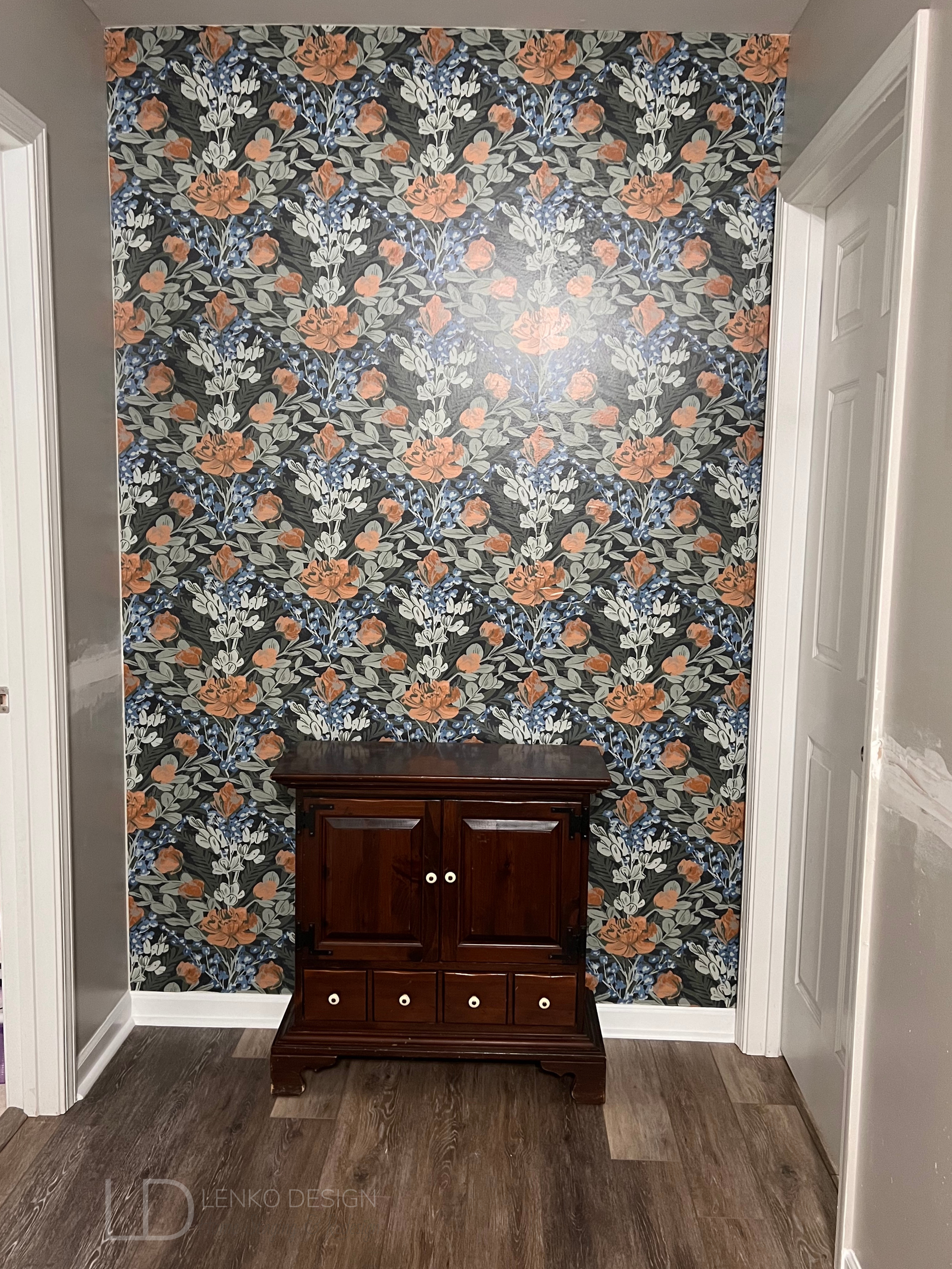
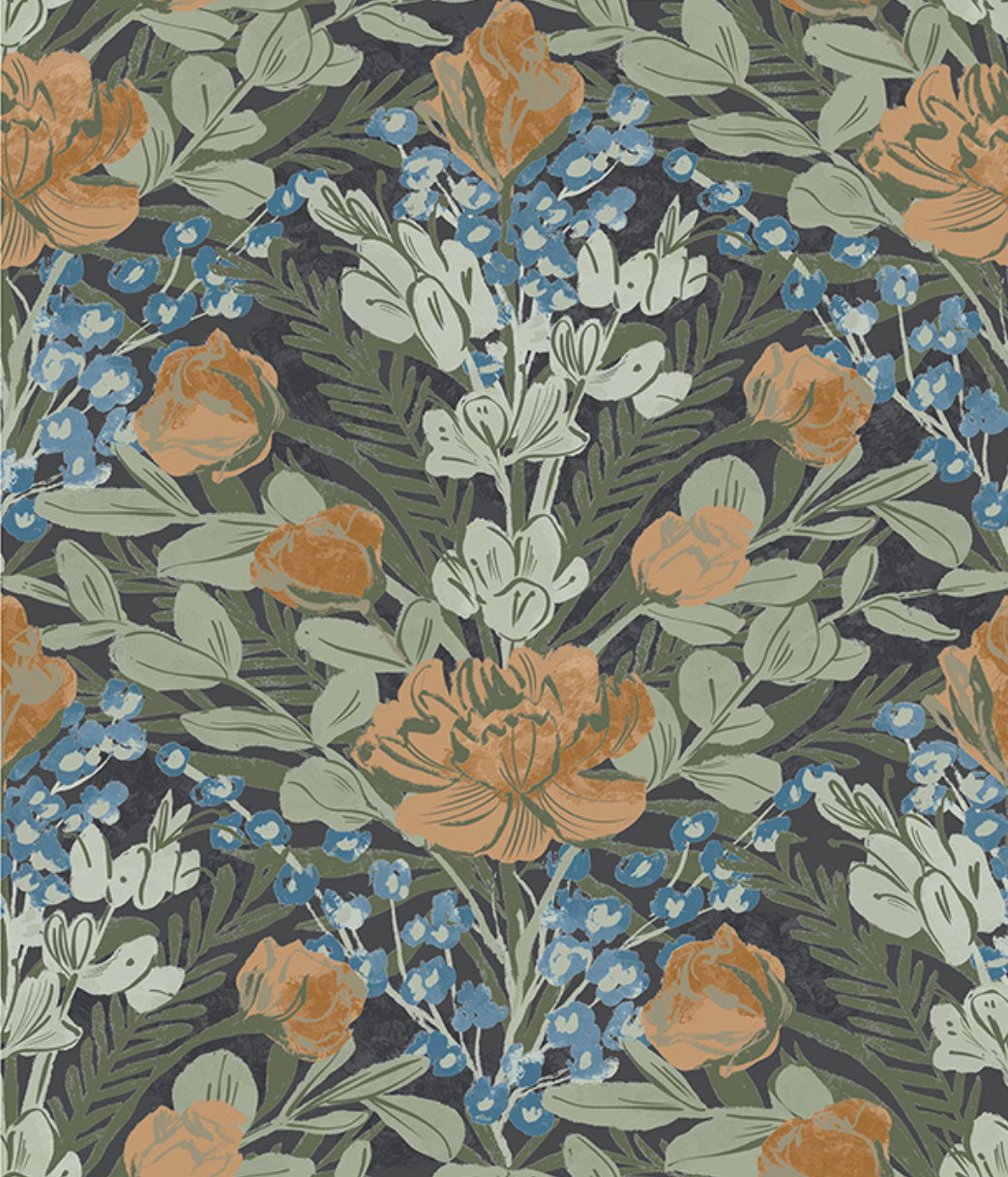
I found this gorgeous Dark Multi Moody June Blooms peel-and-stick wallpaper from WallPops. I loved the blue accent color paired with the different shades of green and tiny bits of orange.
This was my first time installing peel-and-stick wallpaper and it was fairly easy. I did find it a bit challenging to line up the patterns perfectly. I love it though and the print adds so much life and cheerfulness to this dead-end wall.
After applying primer to the wood, we painted a fresh coat of Sherwin Williams Agreeable Gray SW7029 paint on the walls. I opted to paint the board and batten the same as the original paint color as a way to color drench the space. The original white chair rail and trim stood out, and not in a good way!
It took me several days of sanding and fully preparing the walls to be primed and painted.
Once all the painting was complete, we moved our antique pie safe back into place. The blue cabinet which we use for linen storage, was the inspiration behind my selection of wallpaper, area rug runner, and table lamp.
HOT TIP: Find an inspirational piece to begin developing your design plan. This can be artwork, a pillow, an area rug, a pretty pattern on a dish… you can draw inspiration from almost anything! Your design plan will have a purpose once you do. You’ll know what colors or patterns you are drawn to and a clear direction of what you would like to try and incorporate into the space.
To help add some light to this hallway, I found this adorable blue glass table lamp on Amazon and the white wall mirror was on clearance at Hobby Lobby. The mirror helps to reflect light and also makes the hallway feel a bit longer than it really is.
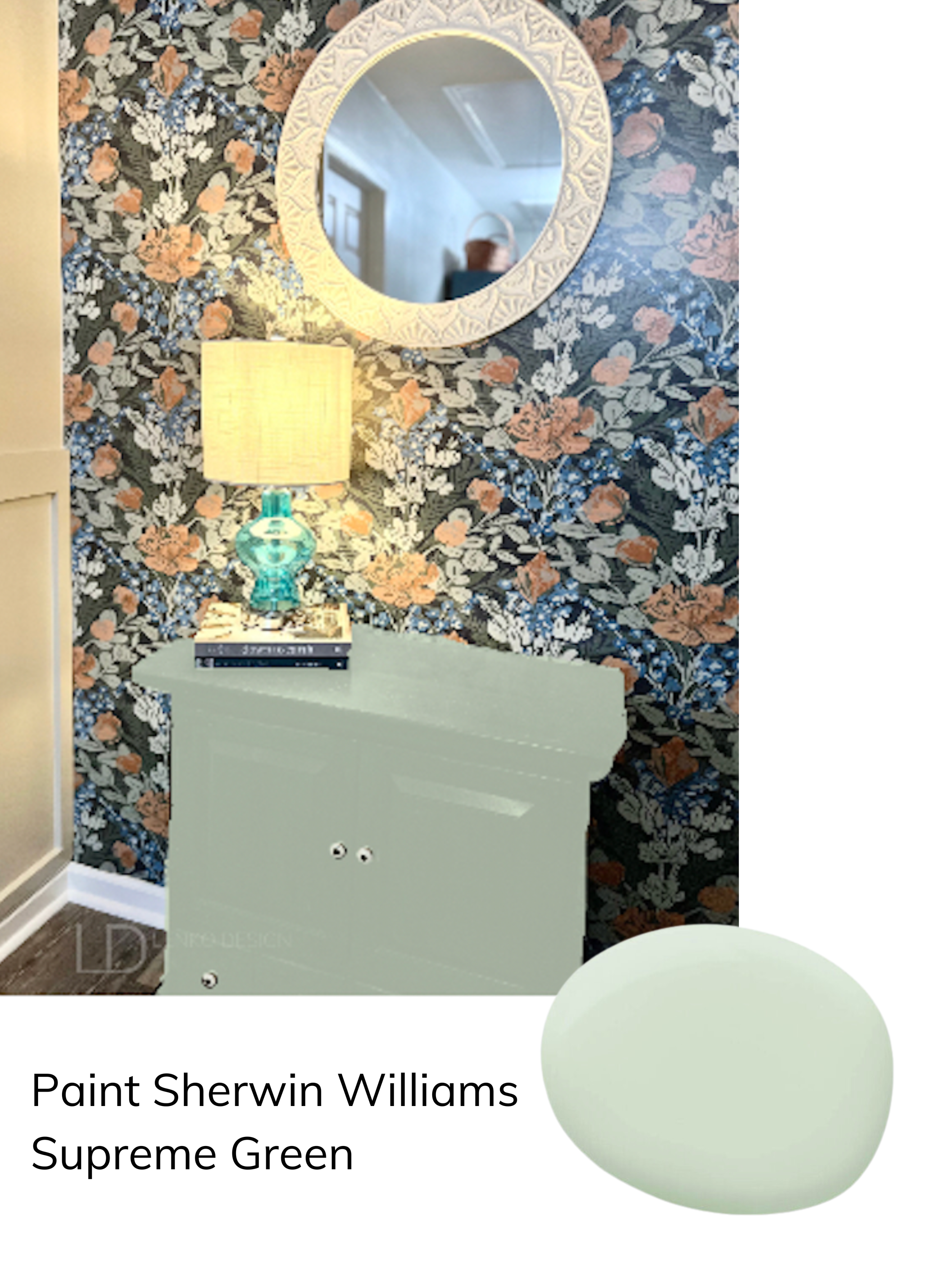
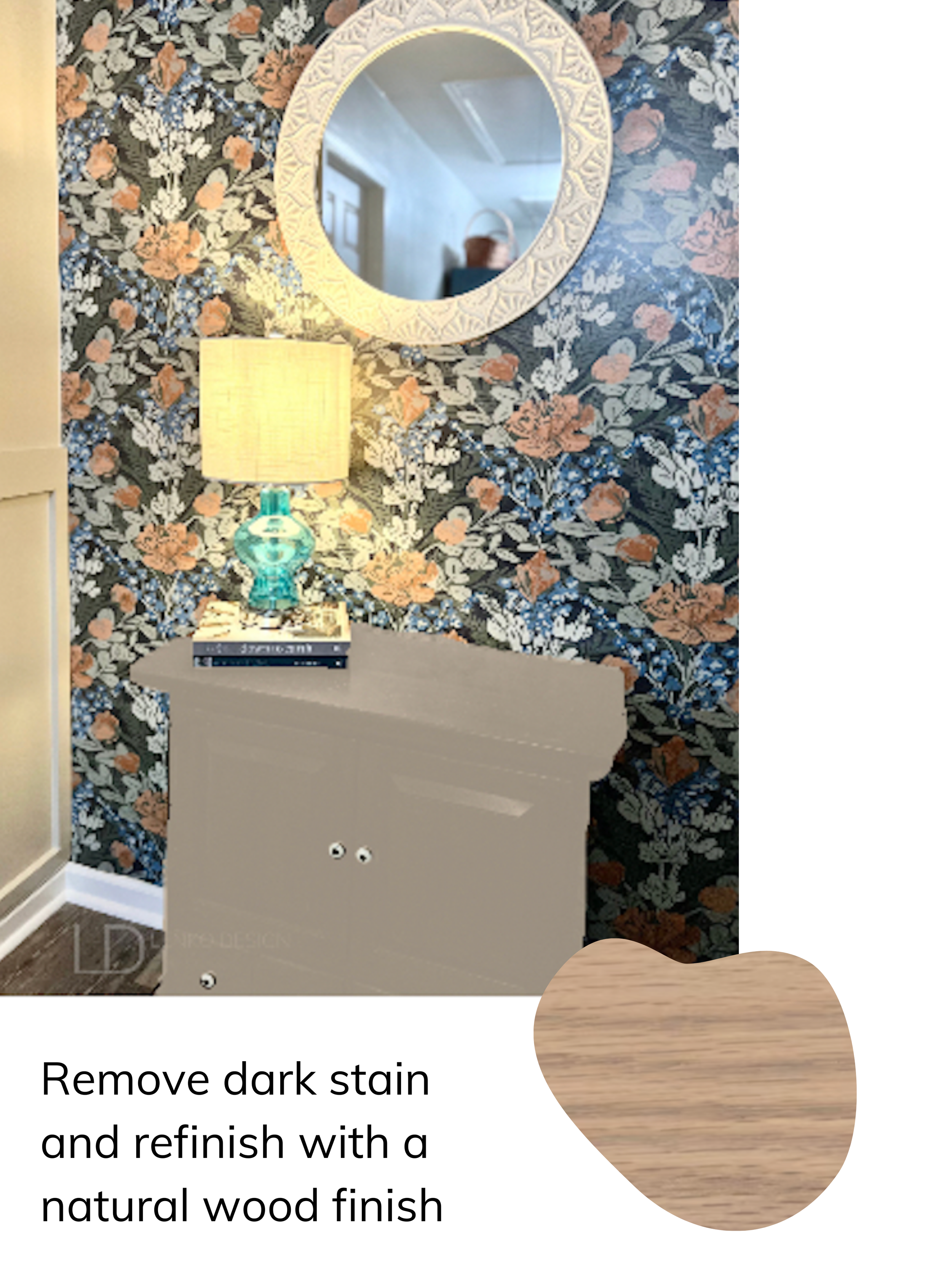
The dark wood cabinet in front of the wallpapered wall has a lot of scratches on it. I’m considering stripping the dark stain and giving this old cabinet a facelift.
What do you think?
Paint the cabinet a light green or go with a more natural-looking wood tone. I’d love to hear your thoughts!
-Tiffani Michalenko
HSR Certified Home Stager & Expert eDesigner


