My passion for interior design derives from helping people just like you solve design dilemmas. My hope is that I can inspire you through my own life journey and what I’ve learned along the way. Thank you for your support. -Tiffani
Paint Color Predictions for 2024
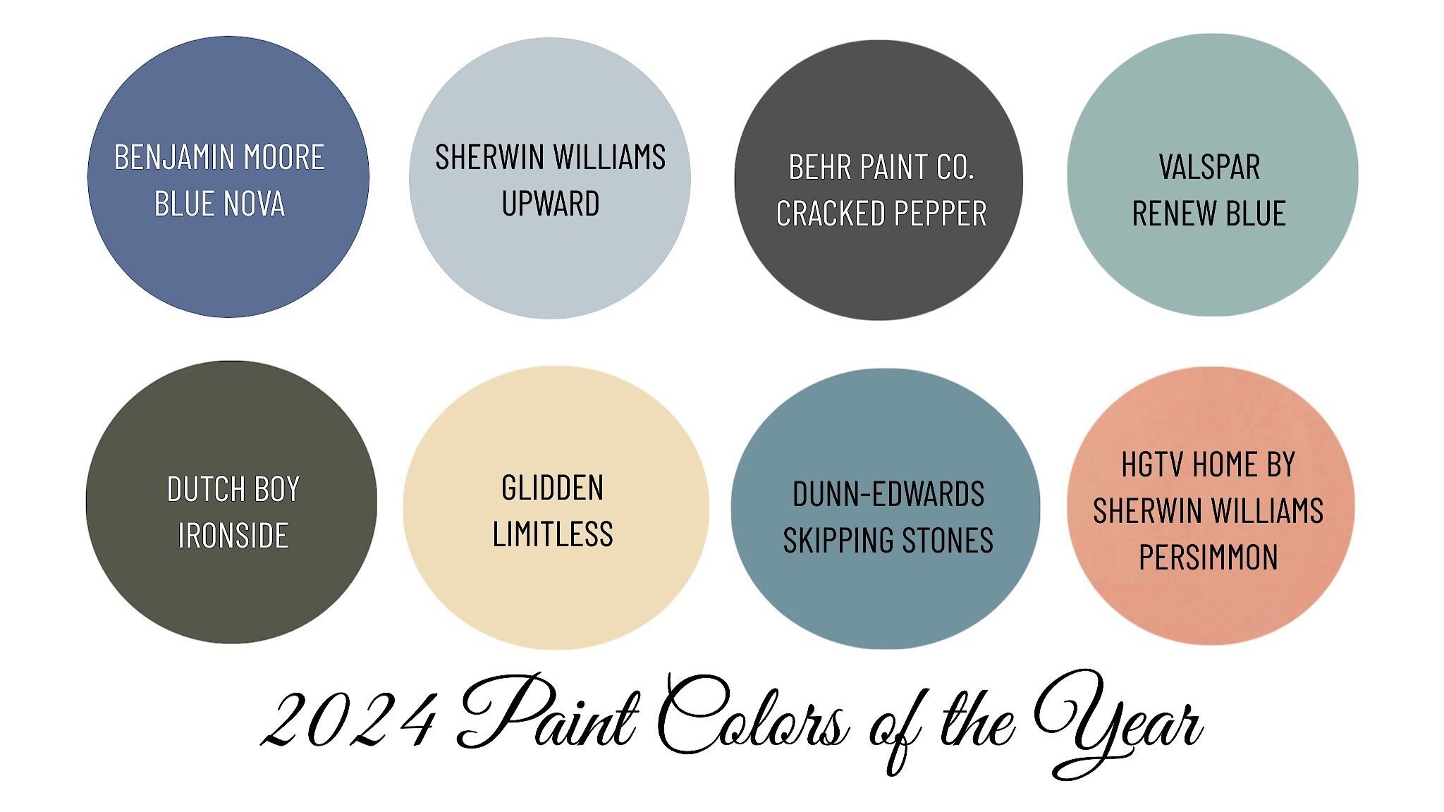
2024 interior paint color predictions.
It’s that time of the year again when all of the major paint manufacturers present their color forecast and announce their representative color for the upcoming year. Each paint company spends hours researching and observing the current cultural climate resulting in colors symbolic to it.
I’m excited for their trend predictions!
Color forecasters are predicting palettes chosen for their distinct presence and personality. 2024 is predicted to be a year of coastal-inspired blues and calming neutrals contrasted with moodier hues, such as olive green and black. This year’s trend cycle is a stark contrast from 2023’s saturated yet playful color palette.
If you are ready to give your walls a fresh update, take a look at what paint manufacturer experts believe will be big next year.
Here’s some color inspiration.
Sherwin Williams
Sherwin Williams announced their color for 2024 is Upward SW6239. A blissful blue hue inspired by coastal aesthetics.
"We knew lighter tones were going to be important in 2024 and 2025 and we wanted to forecast the shift from earthy neutrals to lighter expressions and a light blue like Upward SW 6239 told that story very well," says Sue Wadden, director of color marketing for Sherwin-Williams.
The soft hue complements a variety of design styles and looks great with antiques, modern furniture, transitional pieces, and even boho interiors.
Benjamin Moore
Blue seems to be a recurring color across the paint brands.
Benjamin Moore did not disappoint with their Color of the Year pick Blue Nova 825. “Elevate the everyday and expand horizons through juxtaposed color that is sure to inspire. With Blue Nova leading the way, depth and intrigue are balanced by an undercurrent of reassurance. This alluring mid-tone features an enchanting duality, capturing the spotlight with endlessly classic appeal” Benjamin Moore.
Feeling Blue? Every year I look forward to curating fun mood boards featuring the colors of year chosen by top paint brands Sherwin Williams and Benjamin Moore.
I personally love to design with blue!!!
I think these story boards showcase the personality and versatility of each color.
Which do you prefer?
Behr Paint
Behr Paint Company took a different approach with their color selection.
The selected a moodier, edgier color for those who are ready to embrace a color that encourages homeowners to take a leap. Cracked Pepper PPU18-1 is described as “a versatile soft black hue, acting as a neutral, creating a grounding shade that trends away from classic white-and-cream colors” - Behr Paint Company.
"The moment now is about optimism, awakening the senses, and elevating how you feel—and a room with a soft black really checks the box on all of those things," says Erika Woelfel, vice president of color and creative services at Behr Paint. Cracked Pepper works with everything from dusty pastels and metallic accents to earthy shades and bold patterns and textures.
HOT TIP: Choose your paint color LAST! Trust me on this one. If you paint first and then decorate, the paint color may not work with what you've chosen and you'll end up hating the wall color. Instead, build a color palette off of your fabrics, area rugs, or artwork.
Blue is one of my favorite colors to design with. Below are some rooms in my home where I used blue!
I chose to incorporate Sherwin Williams Granite Peak SW6250 throughout our first floor. The deep hue is rich and so beautiful in person. I selected this blue based on a blue and white vintage inspired area rug.
For a cohesive color palette, Granite Peak was painted on different surfaces beginning at the front door over across to the fireplace, in the Powder Room, and on the half knee wall behind a sofa.
Varying shades of blue are repeated throughout and can be seen in the area rugs, wall decor, table linens, accent throw pillows, drapery fabric, artwork, and blankets.
I think my favorite room is the Powder Room because the walls are blanketed in Granite Peak. Using bold colors in powder rooms is such a fun way to incorporate your favorite color!
I guess I was ahead of the Blue Trend when I selected blue for my home! :)
Did you know that you could boost your home’s selling price by over $10,000 with a select few statistically proven paint colors?
I offer FREE 30-minute Paint Color Discovery Calls to help you choose paint colors that work with the architectural style of your home, your fixed elements, and your specific design style!
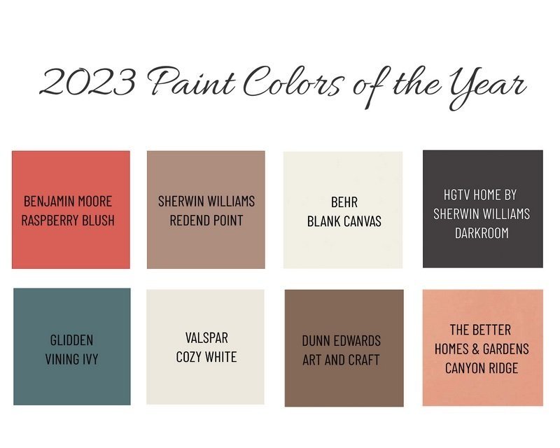
Paint Colors of the Year 2023
2023 paint colors of the year.

Every Fall paint manufacturers present their color forecast and announce their representative color for the upcoming year. Each paint company spends hours researching and observing the current cultural climate resulting in colors symbolic to it.
Let’s check them out!
Color forecasters are predicting palettes chosen for their distinct presence and personality. 2023 is a year of adding individuality to your space and discovering the transformative power of paint with hues inspired by modern art, natural changes that occur in metal, and a desire for self-expression through color.
Here’s the breakdown of the top three paint manufacturers…
Sherwin Williams
Sherwin Williams announced their color for 2023 is Redent Point SW9081. Warmth, intrigue, calming, and versitile are some of the adjectives they used for their paint color selection. SW embraced the spirit of connection with the world around us with this soulful-yet-subtle hue. This minimal yet cozy color creates a comforting backdrop for everyday moments that matter. Here’s to softer spaces!
Benjamin Moore
Make room for a vivacious shade of coral tinged with pink, Raspberry Blush 2008-30 has been named the Benjamin Moore Color of the Year 2023. Enlivening the senses, Raspberry Blush encompasses an electric optimism and is the definition of charismatic color. BM is unapologetic with their choice of red-orange and I personally love it! They had me at a hue that makes a statement! BM drew inspiration from artists desiring to communicate through color, shape, and sound as well as giving individuals a platform of self-expression.
Seeing Red? I put together this vision board featuring the colors of year chosen by Sherwin Williams and Benjamin Moore. They both selected red-based pinks. I think these story boards showcase the personality and versatility of each color. Which do you prefer?
Behr Paint
A much calmer selection, Behr’s 2023 color of the year is Blank Canvas DC-003. Paint forecasters have said over the past few months that consumers are moving away from stark white walls and instead crave warmer beiges. Blank Canvas does not disappoint! As a neutral color, it creates a warm and welcoming atmosphere. This paint color can be used in virtually anywhere… entryways, hallways, main living spaces, in bedrooms, or even on kitchen cabinets. This neutral color offers a comforting appeal yet creates a fresh feeling.
Did you know that you could boost your home’s selling price by over $10,000 with a select few statistically proven paint colors?
I offer FREE 30-minute Paint Color Discovery Calls to help you choose paint colors that work with the architectural style of your home, your fixed elements, and your specific design style!
Painted Cabinets
How to paint kitchen or bathroom cabinets.
The overall aesthetic of my kitchen was mismatched and outdated. Since the cabinets and granite countertops are in great condition, we decided to paint the cabinets.
This is how I did it.
What You’ll Need
I used everything listed below plus some additional brushes I had and buckets to clean with.
Preparation
Step One:
I removed all of the doors and drawers from the kitchen. I took off the knobs, hinges, and clear sticker bumpers.
Step Two:
Once the hinges were removed, I used a Sharpie marker to write what number the cabinet was inside one hinge hole cutout. I then also labeled a piece of blue painter’s tape with the same number and stuck it on top of the number marked with Sharpie. I did this because when the paint was sprayed on, it covered up most of the labels on the painter’s tape. I was able to pull it off and see the numbers clearly for the installation.
I also made labels out of blue painter’s tape for each drawer.
Step Three:
I sanded the cabinet boxes, doors, and drawer fronts using 320-grit sandpaper wrapped on a sanding block.
I wiped everything down with a tack cloth and then using a paint rag, wiped with Liquid Sandpaper.
I then mixed the TSP All-Purpose Cleaner with warm water and wiped everything making sure to get any leftover sanding residue.
Be sure to wear heavy-duty protective gloves during this process!
Hot Tip: Use a hair dryer to heat any sticky residue and scrape it off with a palette knife or flathead screwdriver.
Step Four:
Prep your workspace. Place painter’s plastic down on the floors and on top of countertops to protect from paint spills or drops.
Using the Green Frog Tape, tape all areas where the cabinets meet the walls, floors, appliances, countertops… everywhere you don’t want paint. Be sure to tape two layers side by side. Doing so will make it so that the edge of your paint roller goes on the tape and not the wall.
I taped painter’s plastic on the interior of my cabinet boxes to protect them from unwanted paint splatter.
Applying Primer
Step Five:
Cabinet Boxes
I painted two coats of Zinser BIN Primer on the cabinet boxes. The primer is very thin and smells awful. Make sure you ventilate your room as much as possible.
For the cabinet boxes, I cut in using the 2” flat brush and rolled on the paint everywhere else.
Door and Drawer Fronts
When I primed the doors and drawer fronts, I used the paint sprayer. It was much faster and only required one coat of Primer. The downside was that the paint sprayer used up a lot of Primer. I ended up going through an entire gallon.
I first painted the backs of the doors and drawers. If I made any mistakes or the paint dripped, it was on the back and less noticeable than on the front.
HOT TIP: Wear a properly fitted face mask, eye covering, and gloves when using primer.
I used the mini cone paint stands to prop the doors and drawers up on as they dried.
Once the backs were dry, I painted the fronts and sides and then let them dry.
HOT TIP: I learned that once dry, the Primer dries flaky on the painter’s plastic and painter’s tape. I had to use a lot of tack cloth to get the flakes off before I could paint with the cabinet paint. I probably should have removed the painter’s plastic and then prepped it again with fresh plastic and tape.
Applying the Cabinet Paint
I chose the Nuvo Cabinet Paint because it is easy to work with plus the kit comes with everything you need to get started. Nuvo has several colors to pick from and I really liked that they included very detailed instructions.
I used the Nuvo Cabinet Paint on my bathroom vanities without the top coat that can be purchased separately and the paint has held up very well. I do plan to go back and put a top coat on them just to make sure the paint lasts even longer.
Step Six:
Cabinet Boxes
Using the same method as with the Pimer, I cut in with a 2” brush and rolled the paint on with the cabinet paint roller. I found the Nuvo Titanium White paint to be very thick but applied smoothly.
I didn’t take a picture of this step, but I used the drywall knife to avoid paint bleeding through the painter’s tape onto the flooring. I put the flat edge of the drywall knife on the floor up against the shoe molding and painted on top of the knife instead of painting directly onto the painter’s tape.
It took two coats of cabinet paint to fully cover the Primer. I repeated the painting process with one layer of the Clear Top Coat.
Drawers and Doors
I used one of my daughter’s toy bins that has wheels on the bottom to easily rotate the doors and drawers around while I painted them.
I started with the backs again. I first cut in with a brush and then rolled on the paint with the paint roller.
After the backs were dry, I repeated the process for the fronts.
I let all of the doors and drawers dry overnight and then repeated the process of applying the Clear Top Coat.
HOT TIP: Remove the painter’s tape while the paint is still a little bit wet. This will allow for cleaner edges.
Putting It All Together
Step Seven:
Inspect your paint job to see if there is anywhere you need to touchup, then replace the clear bumper stickers on the backs of the doors and drawers.
Step Eight:
I enlisted the help of my husband to help reinstall the doors and drawers. We replaced the hinges with new soft-close hinges and hung the doors back up.
After the drawers were put back, we installed new knobs and then we admired all of the hard work that went into this transformation!
I am so glad we decided to paint our cabinets! It was a labor of love and definitely took me longer than I anticipated. I think the most time-consuming part of this project was the prep work, but it was necessary to achieve the results I wanted. All in all, this project took me over two weeks to complete. I worked a little bit every day and did what I could while my kids were at school.
Now we have a fresh bright white kitchen that instantly brightened up the entire space!
FREE download! Start planning your next home refresh with this Room Budget Calculator.
Out With The Old… In With The Newly Refreshed Kitchen
An outdated kitchen gets a fresh coat of paint.
When we purchased our house in 2020 we knew that the Kitchen would need a facelift. The layout is perfectly functional, but the overall aesthetic was mismatched and outdated.
The Before
The layout of the Kitchen works for us, but the reddish brown cabinet stain and pink beige tile felt outdated and clashed with the black and white granite countertops.
The hanging pot holder served no purpose and was crooked and off-center. When we removed it, we found out the hanging pot holder wasn’t even secured to a ceiling joist! Thankfully we never hung any pots from it.
The Flooring
The flooring had to go! The pink beige builder-grade tile was chipped, cracked, and clashed with the black and white granite countertops.
With kids and pets, we ultimately decided to install a wood-look LVP (luxury vinyl plank tile) throughout our first floor due to its durability and water resistance.
When installing this type of wood look flooring, it is important to try and run it continuously throughout. Never try to install the flooring up to another type of wood pattern. It will not ever look right because the wood tones will be different and you could timestamp your house.
BEFORE
Do you see how awful the installation was? The previous owners of our house installed LVP next to the old tile. The tile is much thicker than the LVP so we constantly stepped on the “ledge”. Plus, they didn’t bother removing the tile that created a pointed angle that butted up to the column. It drove me nuts that the point was not centered on the column!
AFTER
The Walls and Cabinet Paint
We painted the walls and ceiling with a fresh coat of paint. The walls are Sherwin Williams Agreeable Gray SW7029 in a satin finish.
The reddish brown cabinet stain represented the Tuscan trend from when the house was built in 2008. The cabinets themselves were in great condition so we opted to paint the cabinets a fresh bright white. We also replaced the cabinet door hinges with soft-close hinges as well as replaced the knobs.
Want to find out how I painted my cabinets? See more here.
The appliances were replaced with a matching set and we swapped out the sink faucet for a taller spot resistant brushed stainless steel sink faucet from Moen.
The Result
The Kitchen now feels brighter and makes the entire space feel even more spacious!
What do you think about this Kitchen Refresh?
FREE download! Start planning your next home refresh with this Room Budget Calculator.
2022 Paint Colors of the Year
2022 colors of the year.
Every Fall paint manufacturers present their color forecast and announce their representative color for the upcoming year. Each paint company spends hours researching and observing the current cultural climate resulting in colors symbolic to it.
Are you ready to go green?
Color forecasters are predicting varying shades of green will trend in 2022. According to forbes.com, “the shades of green we will see inspires us to begin again and is a great choice for modern interiors and exteriors”.
Green is such a versatile color that reflects the reality of the worldwide pandemic we’ve all gone through over the past year. A color associated with healing a growth, it’s no wonder why green has been chosen for the color of the year.
Here’s the breakdown from the top three paint manufacturers…
Sherwin Williams
Sherwin Williams announced their color for 2022 is Evergreen Fog SW9130. This green is more of a muted pastel with hints of grey than a classic sage. The color signifies the fog is slowly lifting as we await the newness of life with its soft green. The color is symbolic of gentle growth and slow emergence from what has become the new normal. Evergreen fog is subtle, calming, and creates a serene room in all styles of homes.
Benjamin Moore
Make room for creativity with October Mist 1495, the Benjamin Moore Color of the Year 2022. This gently shaded sage quietly anchors a space, while encouraging individual expression through color.
Behr Paint
Behr’s 2022 color of the year is Breezeway MQ3-21. The color is a silvery green, reminiscent of sea glass, inspiring us to embrace adventures near and far in the coming year. Breezeway evokes feelings of calm and a sense of renewal to discover newfound passions and a zest for life. It is a fantastic color to use in smaller rooms as cool pastels are perfect for expanding the perception of space and would be an excellent color to detail the home’s exterior.
Did you know that you could boost your home’s selling price by over $10,000 with a select few statistically proven paint colors?
I offer FREE 30-minute Paint Color Discovery Calls to help you choose paint colors that work with the architectural style of your home, your fixed elements, and your specific design style!
SUBSCRIBE
Signup for our mailing list so you are always in the know!