My passion for interior design derives from helping people just like you solve design dilemmas. My hope is that I can inspire you through my own life journey and what I’ve learned along the way. Thank you for your support. -Tiffani
Design on a Budget, Inspo, Pro Tips, eDesign Tiffani Michalenko Design on a Budget, Inspo, Pro Tips, eDesign Tiffani Michalenko

Hallway Refresh

Hallway gets a refresh with board and batten and new wallpaper.

This dark dead-end hallway was boring and needed a refresh. Check out what we did to make this a more appealing and happier space!


The Before

Where to start with this dead-end hallway? The overall darkness, the chair rail, the awkward yet narrow walkway, or the lack of a linen closet…

I’ve always been bothered by the floor plan layout of this hallway. The angled wall to the right creates a very narrow walkway from the landing of the stairs. Since we aren’t changing the walls or layout of this space, I had to decide on what could be changed.


What We Did

We opted to remove the unnecessary chair rail. Chair rail has a place in dining rooms to protect walls from chairs being pushed up against the wall. Why the chair rail was installed upstairs in this hallway will always be a mystery to me!

We repaired the walls from the chair rail removal and installed board and batten.

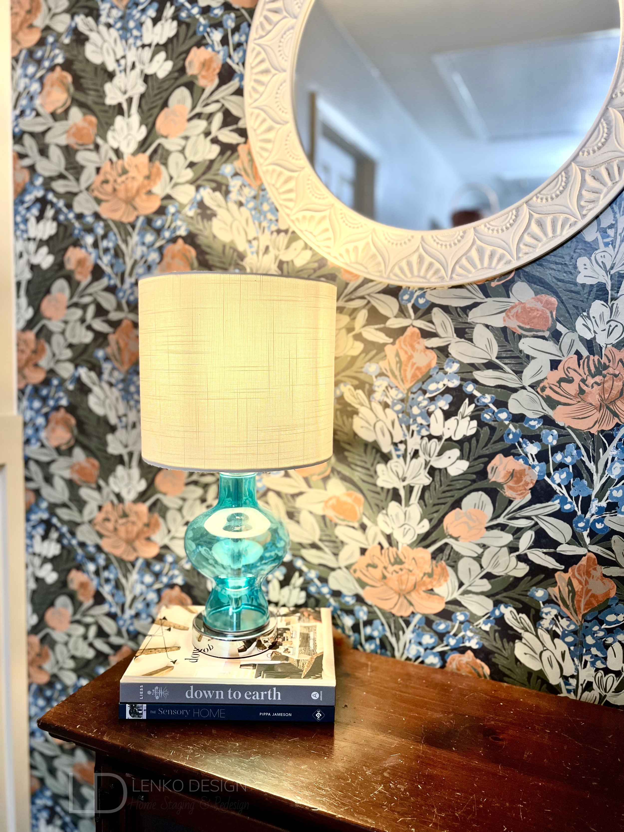
I found this gorgeous Dark Multi Moody June Blooms peel-and-stick wallpaper from WallPops. I loved the blue accent color paired with the different shades of green and tiny bits of orange.

This was my first time installing peel-and-stick wallpaper and it was fairly easy. I did find it a bit challenging to line up the patterns perfectly. I love it though and the print adds so much life and cheerfulness to this dead-end wall.

After applying primer to the wood, we painted a fresh coat of Sherwin Williams Agreeable Gray SW7029 paint on the walls. I opted to paint the board and batten the same as the original paint color as a way to color drench the space. The original white chair rail and trim stood out, and not in a good way!

It took me several days of sanding and fully preparing the walls to be primed and painted.

Once all the painting was complete, we moved our antique pie safe back into place. The blue cabinet which we use for linen storage, was the inspiration behind my selection of wallpaper, area rug runner, and table lamp.


HOT TIP: Find an inspirational piece to begin developing your design plan. This can be artwork, a pillow, an area rug, a pretty pattern on a dish… you can draw inspiration from almost anything! Your design plan will have a purpose once you do. You’ll know what colors or patterns you are drawn to and a clear direction of what you would like to try and incorporate into the space.

To help add some light to this hallway, I found this adorable blue glass table lamp on Amazon and the white wall mirror was on clearance at Hobby Lobby. The mirror helps to reflect light and also makes the hallway feel a bit longer than it really is.


The dark wood cabinet in front of the wallpapered wall has a lot of scratches on it. I’m considering stripping the dark stain and giving this old cabinet a facelift.

What do you think?

Paint the cabinet a light green or go with a more natural-looking wood tone. I’d love to hear your thoughts!


-Tiffani Michalenko

HSR Certified Home Stager & Expert eDesigner


Read More

Out With The Old… In With The Newly Refreshed Kitchen

An outdated kitchen gets a fresh coat of paint.

When we purchased our house in 2020 we knew that the Kitchen would need a facelift. The layout is perfectly functional, but the overall aesthetic was mismatched and outdated.


The Before

The layout of the Kitchen works for us, but the reddish brown cabinet stain and pink beige tile felt outdated and clashed with the black and white granite countertops.

The hanging pot holder served no purpose and was crooked and off-center. When we removed it, we found out the hanging pot holder wasn’t even secured to a ceiling joist! Thankfully we never hung any pots from it.


The Flooring

The flooring had to go! The pink beige builder-grade tile was chipped, cracked, and clashed with the black and white granite countertops.

With kids and pets, we ultimately decided to install a wood-look LVP (luxury vinyl plank tile) throughout our first floor due to its durability and water resistance.

When installing this type of wood look flooring, it is important to try and run it continuously throughout. Never try to install the flooring up to another type of wood pattern. It will not ever look right because the wood tones will be different and you could timestamp your house.

BEFORE

Do you see how awful the installation was? The previous owners of our house installed LVP next to the old tile. The tile is much thicker than the LVP so we constantly stepped on the “ledge”. Plus, they didn’t bother removing the tile that created a pointed angle that butted up to the column. It drove me nuts that the point was not centered on the column!

AFTER


The Walls and Cabinet Paint

We painted the walls and ceiling with a fresh coat of paint. The walls are Sherwin Williams Agreeable Gray SW7029 in a satin finish.

The reddish brown cabinet stain represented the Tuscan trend from when the house was built in 2008. The cabinets themselves were in great condition so we opted to paint the cabinets a fresh bright white. We also replaced the cabinet door hinges with soft-close hinges as well as replaced the knobs.

Want to find out how I painted my cabinets? See more here.

The appliances were replaced with a matching set and we swapped out the sink faucet for a taller spot resistant brushed stainless steel sink faucet from Moen.

The Result

The Kitchen now feels brighter and makes the entire space feel even more spacious!


What do you think about this Kitchen Refresh?


FREE download! Start planning your next home refresh with this Room Budget Calculator.


-Tiffani Michalenko

HSR Certified Home Stager & Expert eDesigner


Read More
Design on a Budget, Inspo, Pro Tips, eDesign Tiffani Michalenko Design on a Budget, Inspo, Pro Tips, eDesign Tiffani Michalenko

Pantry Refresh

An organized pantry equals easy access to food and cookware plus an immense feeling of order.

Pantry Goes From Dysfunctional to Completely Organized

Holy pantry space! This oversized pantry recently got a facelift and I’m here to share with you how we did it. 

pantry before after.png


The Before

Disorganized and cluttered, things fell through the wire shelving. A very frustrating space that made me feel overwhelmed every time I walked in.

Disorganized and cluttered, things fell through the wire shelving. A very frustrating space that made me feel overwhelmed every time I walked in.

When my husband I bought our house we were shocked at the size of our new pantry. We’ve only ever had a small closet space to use. This pantry could easily fit bunk beds LOL! 

The drab basic builder-grade white wire shelving was over twelve years old, dirty, stained, and not functional for adequate food storage. The vertical posts made it challenging to organize food and the open shelving caused things to fall through the cracks all the time.


What We Did

First, the wire shelving was torn out and the many, many holes left in the walls were patched. 

We painted a fresh coat of Sherwin Williams Agreeable Gray SW7029 paint to the walls and I worked on the staining and adding a coat of Polyurethane to the wood shelves my husband cut and sanded. I used the Dark Walnut #2176 stain finish by Minwax.

The shelves vary in length according to the wall-length but are all right at 11” deep.

We spaced out all of the brackets and fit each shelf. This required us to trim some of the wood so it was a perfect fit.

One by one we spaced out the brackets determining how much height we wanted between shelf levels and the shelving space came to life. We maximized every square inch in this space!

Pantry Measurements.png

Once all the shelves were up, the room overall felt more open and spacious, but the dark wood tone absorbed much of the light so we decided to also update the semi-flush mount light.

Voila, instantly more light! 

pantry light.png

The fun part began with a shopping trip to IKEA where I was able to source most of the storage bins. I found the clear bins on Amazon. You can download a free copy of all the products I used here.

I organized all the food and made my own vinyl labels with my Silhouette cutting machine.

You could certainly download free printable labels and print them on sticker paper or use a marker and handwrite them!


All Done

pantry after.png

Everything now has a place and I couldn’t be happier channeling my inner KonMari!  


What do you think about this Pantry Refresh?


FREE download! Shop my favorite organizational products used to accomplish this Pantry Refresh.


-Tiffani Michalenko

HSR Certified Home Stager & Expert eDesigner


Read More

SUBSCRIBE

Signup for our mailing list so you are always in the know!